Within this process and production lesson with Sara, it was our final lesson. We were given the task of creating our very own showreel which would present all our work that we have created over the past year that I had created using the programme Adobe After Effects. I found that this task was very interesting as it would feature all my final pieces from second year which I am really proud of. The programme that I used for this process and production lesson was Adobe After Effects. Over the past year I have felt that my After Effects skills has definitely improved over the past year. As I have learnt new skills and techniques with after effects. Before I started to create this showreel, I had to think about how I wanted to present my designs within the showreel. I had to make sure that the set up for the showreel was correct at 1920 x 1080. I also had to make sure that the animation was 30 seconds long, however it had to feature clips of my animations that I had created.
The part that I am least happy with was the transitioning between each of the animations because I feel that these could have been slightly better, and more visible because I feel that sometimes you can't see when the design is changing from animation to animation. The only part that you can tell this with is when you see the text explaining what animation is going to be playing next. To improve on this in my spare time I will look at this more closely to work out better transitioning that would be more suitable for the animation and showreel that I am creating.
My favourite part about this animation was the beginning part of the showreel when the text introduces my name and the topic of what is being displayed in this animation. Another part that I like about the design is the layout and the structure that I followed for this design because I think that this allows me to present my work in a professional and presentable way that the target audience or viewers will find easy to see.
Once I had finished my animation/showreel I had to make sure that I chose a relevant song that would fit and work well with the design that I had created for my final piece. The music that I used for this design was from the website called Ben Sound, the song was known as Cute. The font style that I chose to use for this design was Bebas Neue, I chose to use this font style because it was bold and stood out well it was also very easy to read and see. I decided to stick with the colours Yellow and White because I felt that these colours worked well together, as they were very contrasting.
Thursday, 4 May 2017
Jay Cinema 4D - Lesson 3
Within this process and production lesson with Jay, the task that we were given for this lesson was to use the programme known as Cinema 4D. Within this lesson we were told that we were going to be creating our own Beer bottle, Bottle Top, Beer Cans and packaging design. I found that this task would be very interesting and very different to the other process and production lessons that we had with Jay. I thought that this task would be more difficult than the last lessons because I think that the designs we would be creating would be slightly complicated. We firstly started off by opening up the files that we were given to use for the materials for the designs that we would be creating in cinema 4D.
The first thing that we created within this programme was the Beer bottle. I found that this design that I had created for the design was very creative, before adding the design onto the beer bottle I had to open up the design in adobe illustrator to change the settings of the design to an Illustrator 8 file. This is so that the design would work correctly on the material that I was going to create onto the programme. After we had created the bottle in the programme, I was then able to place the design of the label onto the design using the material option which I had to place on the Lathe tool. We also had to make different materials to add to the bottle to create a glass look on the bottle and another material for the liquid which is inside the bottle. We then created the bottle top to match the design and the label that we had created for this beer bottle. I felt that this design was alright, but to improve on this design I am going to create my own label that I would create in the programme Adobe Illustrator.

The next design that I created for this process and production lesson was to create some soda cans, I found that when creating these soda cans these designs were very simple but effective. To add the design to the soda cans I had to use the Illustrator 8 file and add it as a material to create the design to the cans. We were given the template for the cans design, as we only had to place these onto the designs that I had created in Cinema 4D. The part that I like about this design was that the packaging of the design made it stand out and look like a actual product to sell. To improve on this design I am going to create my own design in which I will place onto the cans using the material tool. When creating this design I feel that it would be best to create a design that would also fit and work with the beer bottle that I had created and i'm going to develop further.

For the final part in this process and production lesson we looked at creating a piece of packaging that was shaped like a cereal box. Again I created the box using the cube object that can be found in the top menu on the screen. I found that this design was a lot simpler than the other designs that I had created within this process and production lesson, as it was a box rather than something slightly more complicated like beer bottles and beer cans. Overall I am impressed with how this design turned out, as I again were able to place the design in which we were given to be placed on the box design. To do this I had to create a new material and add a texture to the design. To improve this I am going to create a new design piece that will work with the other two design that I will create for the soda cans and beer bottle.

Overall I really enjoyed this process and production lesson because I was able to learn a lot of new skills within the programme Cinema 4D, that I will be able to use in the future and future projects.
Here are the designs that I created in my own time, I like these designs because I think that they connect well with each other as they are all part of the same style and branding that I created, so it was like a collection of things, that a company was selling. I am really happy with how they have turned out because I think that they stand out, look professional and work well.


Process and Production Nick - Lesson 5 Stencil Prints
This is my fifth process and production lesson that I had with Nick this year, I like these sessions because they're very productive and allow me to do something that I wouldn't usually do and create for my final pieces for my projects. I think that these sessions allow me to expand on my knowledge and skills that allow me to be a creative designer. Within this process and production lesson with Nick we again like the previous lesson worked with stencils, however this week we were working with three different font styles to use within this lesson. These font styles were known as Courier Bold, Baskerville Bold and Cooper Std. I liked that all these fonts were very unique but also had very different styles to one another, I think that these font styles are nice font styles and easy to use and work with for this process and production lesson. For the task that we were given in the lesson was to not use the whole of the letter, but elements of different characters or letters. For example the bottom of the R or the middle of the letter B. This was to create a new and creative characteristic that we could work with.
The first font style that I decided to work with within this lesson was Courier Bold. The elements that I decided to use from this font style was a part of the Number 5 and Letters P, J and U. Before I started to create my pattern, I firstly had to draw out the shapes and elements onto a A3 piece of paper that I had been given. To do this I used a pencil because I feel that if I had drawn the designs out with a fine liner I would have messed up the shape that I wanted to create for the design, I had to draw some of the shapes out very faintly to make sure that I got the basic shape of the design and elements. After I had drawn out the elements onto the sheet of the A3 paper I then had to use a craft knife to cut out the outlines of the elements that I had drawn. I found that this task was quite easy to do because I have noticed that over the past few process and productions lessons that I have had with Nick I have a steady hand which cuts around the outline of the elements very easily and carefully. Once I had cut the elements out of the A3 paper I then was able to start create a pattern on a new piece of paper. However before I started to create the pattern I decided very carefully about what I wanted to do with the design to make it look professional and bold, so that it would stand out and be easy to see by people. Although I still wanted the design to be very clean and look neat.


Overall, I really enjoyed this process and production lesson. This is because I again learnt new skills that I could use in the future for my future project.
The first font style that I decided to work with within this lesson was Courier Bold. The elements that I decided to use from this font style was a part of the Number 5 and Letters P, J and U. Before I started to create my pattern, I firstly had to draw out the shapes and elements onto a A3 piece of paper that I had been given. To do this I used a pencil because I feel that if I had drawn the designs out with a fine liner I would have messed up the shape that I wanted to create for the design, I had to draw some of the shapes out very faintly to make sure that I got the basic shape of the design and elements. After I had drawn out the elements onto the sheet of the A3 paper I then had to use a craft knife to cut out the outlines of the elements that I had drawn. I found that this task was quite easy to do because I have noticed that over the past few process and productions lessons that I have had with Nick I have a steady hand which cuts around the outline of the elements very easily and carefully. Once I had cut the elements out of the A3 paper I then was able to start create a pattern on a new piece of paper. However before I started to create the pattern I decided very carefully about what I wanted to do with the design to make it look professional and bold, so that it would stand out and be easy to see by people. Although I still wanted the design to be very clean and look neat.


I then started to place the stencils into the spaces that I wanted to, after doing this I started to use the black paint in order to create a pattern using the stencils that I had created whilst using a font style. Once I had created this design I found that it looked very professional and neat, I think that the colour of the allowed the layout and the stencils to stand out and look bold. I thought about pushing this design even further by looking at creating a little animation to show the shapes changing from the original shape to something different and then returning to there final shape.


I then moved on to work with the typeface known as Baskerville Bold, I liked this font style because again I found it clean and interesting. I again took the same following steps that I had taken with the last font style, as I firstly started out by picking out elements of the typeface. I decided to be a little more interesting a choose different letters from this typeface. I found that this font style was quite easy to grasp when drawing out the elements. Before creating the pattern on the paper, I firstly had to draw out the elements that I had chosen to use on a another sheet of paper in which I could use for my stencils. After I had done this I again cut out the elements using a craft knife, I found this quite easy as I have started to get used to using a craft knife. I then started to look again at the arrangement of the elements on the sheet like the last design, as I again wanted the design to be professionally laid out and look clean and sharp. However, I also wanted it to look bold and standout so that it would interest people to have a look at the design. I like this design because I like how the paint I used gave it a washed effect that made it look vintage and different to the previous design.


The next typeface that I used within this process and production lesson was the typeface known as Cooper Std. I found that this font style was a lot more bolder and stood out a lot more than the other typefaces that we were using within this lesson. I found that this typeface was slightly harder to draw out the elements than the last two because I think the elements were a lot bolder as the style is very different to the other font styles. Once I had chosen the elements that I wanted to work with for this design, I started out by drawing out the elements using a pencil on a blank piece of paper to use as a stencil for my design. After I had drawn out each element onto the sheet of paper I was then able to start and cut around the shapes to create the stencil using a craft knife. Before starting to paint the stencil, I decided to use a different roller brush which was a slightly more fluffy and would give my design a different effect to the outcome. However after I had finished print the design using this brush I had noticed that it had made my design a lot messier than the previous two. Although I was happy with this because I felt that it was nice to create something different, bold but messier.


For the final part in this process and production lesson, we were told that we should creating something new or a letter using the three different typefaces to create a design. I decided that I wanted to create my initials using the three different font style, to create each letter. I started off by the looking at each of the same letter for all the different typefaces, because I wanted to think about how I could create this design and see how it would work. I firstly started out by drawing an element of each to create the design, using a pencil on a blank sheet of paper. After I had worked out each element to make up the letter, I was then able to put this together to create my final piece for the letter R. I was then able to cut this out using a craft knife to use as a stencil for the letter, at first I decided to print the letter at a portrait angle to see how the design would look. I thought that the design came out really well which I was happy about.


I then decided to do the same for the other two initials of my name which were the letters J and T. I again repeated the process and chose elements of each to create each letter. Before printing on the paper I had to think about arrangement of the letter, to see where I wanted to place the letter. I also had to think about how hard I did the print so that the letters would be visible and easy to see when printed on the paper. I felt that overall this design didn't look too great as I wasn't happy about how the design looked for this print.


I decided to go a little further with this design and look at creating a landscaped design using the three letters that I had just created for this design. I felt that this design worked a lot better than the portrait design because I thought that this design was a lot clearer and sharper than the other. I felt that the design was a lot bolder than the other design.

Overall, I really enjoyed this process and production lesson. This is because I again learnt new skills that I could use in the future for my future project.
Wednesday, 22 March 2017
Process and Production Nick - Lesson 6 Wall Moral
For this process and production lesson with Nick, we had to work in groups in order for this task to work. As this was our final process and production lesson with Nick, I was very excited to see what this lesson would bring as I really enjoyed the previous lessons with Nick. This is because I found them really fun and interesting because it was something that I hadn't done before in Graphic Design. I felt that these process and production lessons with Nick have allowed me to develop my skills and learn new ones that allow me to be a Graphic Designer.
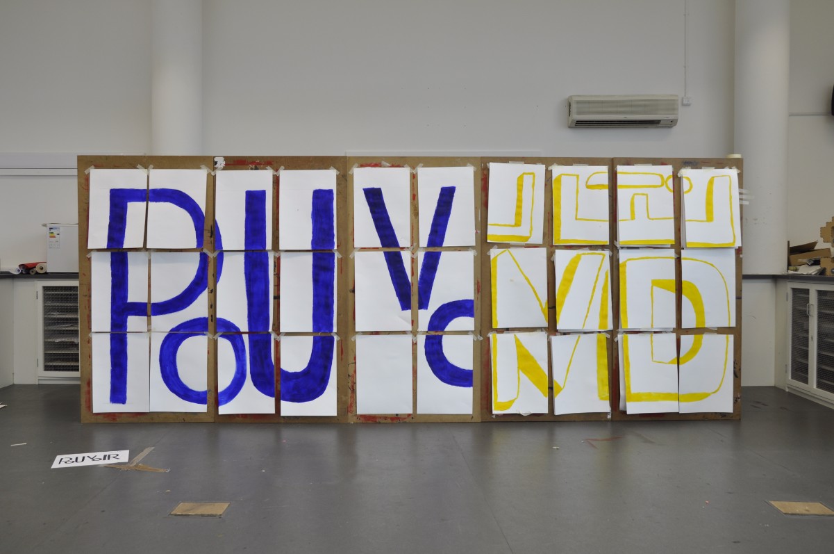
The first thing that we did within this process and production lesson was split into the groups that we would be working with for this process and production lesson. Once we had done this we then had to pick out a word at Random, that we would be working with for this lesson. The three words that we had to pick out at random were "L'Imagination Prend Le Pouvoir" The words that we could choose at random from were known as Imagination Takes Power.
My group picked out the word Pouvoir which was the last word of the sentence, so within this task we were going after the other two groups. before starting the task we were given we had to go back to our tables and produce a design from each person that was in our group. These designs would then be voted by the whole class in order to determine which designs would be used for the final piece. Once we had all done this we then to place all the designs on the floor for everyone to look at. We then had to take three post it notes to use to vote for our favourite design of each word. After we had done this we then had to see which of the designs we would be using for the final piece and the stop motion animation that would feature our final pieces and transitions.


I was really pleased with how my design turned out because I am starting to like type a lot more as a Graphic Designer. I think that I am learning a lot about the style and developing my skills in this area. Overall I got 5 votes for my design, but the design that won the majority vote for our group was my friend Cath, whose design I voted for because I really liked the design that she had created.
After the vote was made we then had to work out how we would produce the design of the word at a larger scale using 30 sheets of A3 paper. One point that allowed us to make this a lot easier for us to create the design was the sheet of paper that we had originally created the design on, as it used a grid to help us work and scale the design a lot better. Before painting the design we firstly had to draw out the design using a pencil, as their were 7 of us we were each allocated a letter for us to draw out. The letter that I was given was the second "O", at first I found it quite hard to draw the outline of the "O" because I think there one of the letters that I find tricky to draw. This is because I can never draw a perfect circle. However in the end I finally got the basic shape of the "O" I was then able to complete this for the design.
Once we had drawn out our letter we were then able to start painting the design in which we had created at a larger scale. Before we could start painting the design we were then asked as a group to choose a colour t random from Blue, Red and Yellow. The colour that our group chose was Blue, I felt that this colour worked and fit well with the word and design that we had created. After choosing the colour we were then able to start painting the design. I found that this task was very interesting as I felt that the task we had been given was exciting and very different to the other process and production lessons we had throughout the year.


After we had painted the word I felt that the colour allowed the design to stand out and look very bold and bright, but also very powerful. When we had finished this we then had to wait for the other two groups to complete there photographs and transitions for the stop motion animation that would be the final outcome of this process and production lesson. Before doing our transitions and photographs we had to think about how we would like to present our design on the wall by thinking about how we would put them up and take them down, which allowed us to look at the transitioning of the design.


We decided that we firstly would take the other groups paper down one by one, however as we were doing this we were then replacing this with our design one by one. We did this until we had completely filled the board with our design. As this was happening Charlotte from our group was taking the photographs for our stop motion animation. Once we had finished putting up our designs we were then allowed to take down our papers in a fun and exciting way which was pulling them off the wall and ripping them down as a group and throwing them behind us.


The first thing that we did within this process and production lesson was split into the groups that we would be working with for this process and production lesson. Once we had done this we then had to pick out a word at Random, that we would be working with for this lesson. The three words that we had to pick out at random were "L'Imagination Prend Le Pouvoir" The words that we could choose at random from were known as Imagination Takes Power.
My group picked out the word Pouvoir which was the last word of the sentence, so within this task we were going after the other two groups. before starting the task we were given we had to go back to our tables and produce a design from each person that was in our group. These designs would then be voted by the whole class in order to determine which designs would be used for the final piece. Once we had all done this we then to place all the designs on the floor for everyone to look at. We then had to take three post it notes to use to vote for our favourite design of each word. After we had done this we then had to see which of the designs we would be using for the final piece and the stop motion animation that would feature our final pieces and transitions.


I was really pleased with how my design turned out because I am starting to like type a lot more as a Graphic Designer. I think that I am learning a lot about the style and developing my skills in this area. Overall I got 5 votes for my design, but the design that won the majority vote for our group was my friend Cath, whose design I voted for because I really liked the design that she had created.
After the vote was made we then had to work out how we would produce the design of the word at a larger scale using 30 sheets of A3 paper. One point that allowed us to make this a lot easier for us to create the design was the sheet of paper that we had originally created the design on, as it used a grid to help us work and scale the design a lot better. Before painting the design we firstly had to draw out the design using a pencil, as their were 7 of us we were each allocated a letter for us to draw out. The letter that I was given was the second "O", at first I found it quite hard to draw the outline of the "O" because I think there one of the letters that I find tricky to draw. This is because I can never draw a perfect circle. However in the end I finally got the basic shape of the "O" I was then able to complete this for the design.
Once we had drawn out our letter we were then able to start painting the design in which we had created at a larger scale. Before we could start painting the design we were then asked as a group to choose a colour t random from Blue, Red and Yellow. The colour that our group chose was Blue, I felt that this colour worked and fit well with the word and design that we had created. After choosing the colour we were then able to start painting the design. I found that this task was very interesting as I felt that the task we had been given was exciting and very different to the other process and production lessons we had throughout the year.


After we had painted the word I felt that the colour allowed the design to stand out and look very bold and bright, but also very powerful. When we had finished this we then had to wait for the other two groups to complete there photographs and transitions for the stop motion animation that would be the final outcome of this process and production lesson. Before doing our transitions and photographs we had to think about how we would like to present our design on the wall by thinking about how we would put them up and take them down, which allowed us to look at the transitioning of the design.


Overall I really enjoyed this Process and Production lesson with Nick, I found that this lesson was very interesting and allowed me to expanded on my skills in a way that is very creative and different to the other Process and Production lessons that I have.
Monday, 6 March 2017
Business Lecture Summary Number 1
Year 2 Business Issues Summary 1
We started out this lecture by looking at a picture of the earth from the moon, and look at the earth in a different perspective. This looks very different, within this year we have talked about China, India, USA, Russia and Europe, where we have looked at the different internal structures.
Interconnections between regions and countries, trade and its importance. Not all is well within each country and the the normality. Internal stresses ned to be monitored, by lots of different groups, areas and companies. Something that we don’t need to consider but keep in mind and know about.

Consequence: Global economic structures are in a state of flux.
This due to many issues that are Political, Cultural, Social and Technological.
It is adapting your designer ability to work with the company. What is it the client is trying to do.
As such things change and alter, new opportunities arise - as indeed do new threats, this provides moral and ethical issues for each one of gusto grapple with. Your views need to be justified to yourself, in context with the situation…. This is difficult!
So: We now have an understanding of global issues, and how they interplay and the key elements
This global situation is the back drop which you will be involved with when your in a business and whatever the business is.
We then looked at the National Economy
The National economy is affected by the global Economy. This results in the changes with the national economy to be Induced and Directed.
Induced Effects
Here, external changes to the UK cause Internal changes. Such as GM sells the company Vauxhall to PSA (Peugeot). Peugeot closes some UK Vauxhall plants Unemployment in these areas rise. These are often called “externalities” You should keep an awareness of what happens because they’re important and might effect you. An example of this is - One of your main clients faces difficult business conditions, you business with them may be reduced. On a more daily basis, changes in Exchange Rates can effect trading ability. The movement could cause a few problems if it affects you firm, as the cost could up or it could go down.
Directed effects - These effects are related to internal changes that have a knock effect to the national economy, which means that they are directed to occur.
So-
Taxation changes
Legal changes - including standards
Financial assistance changes, etc.
Some of these changes may be as a result of external forces. Reaction to external changes - tariffs, quotas, etc.
We need to justify ourselves as we need to be more than just designers, we need to make sure that we have knowledge of everything else.
Directed issues can be local and national;
think business rates / council taxes.
To you (as designers) this is probably more important. Such directed changes will affect you. They will also affect your clients.
We found that changes happen all the time.
As designers, you need to recognise that these changes and we have to consider how they impact on us AND on the clients that we work with. This means that this will us to be more understanding of your clients situation. An example of this is payment issues and nothing else.
Market Issues
You and your work in terms of the market you are going to be in, you need to think border.
Competitors are those who do similar work, those who may attract clients money, but are not directly competitors.
They attract money from you.
Markets
Geographical / Location
Market Segment
Customer Type
Design need
Your Business
What you do and end up with, do you have / are developing a specialism in one or more of those areas?
If yes, you MUST keep an eye on the sector performance. We have to be prepared to diversity if need be.
If no, you are a generalist, fine, but ensure you are very good and business like.
Continually assess your market(s)
Just as you review your state (PDP) You also need to review the state of your clients
At the very least we should review with them, with your firm at least once a year. But we also have to consider whether the business activity of the clients has impacted you, for example the market and finances.
Consider membership of relevant trade organisations, there are thousands of them which could help you.
We were told that we should attend trade exhibitions, to look at and see what the market you serve is doing. A few examples of trade shows that we could attend were:
IPEX
Adtech
TfM
Future of Branding
Print and Promotion Live
Sufex
We then looked at the diagram that we were shown in the very first week of the second year at University. We were told that we all need to consider this advice with WHATEVER business we work with.

Wednesday, 15 February 2017
Jay's Cinema 4D Lesson 2
Within this process and production lesson we will be introduced to dynamics and particle systems purposed for randomised design. Our final outcome from this will be a series of design experiments using the programme Cinema 4D. Within this lesson we will be looking at the:


1. Set Up Work folders
2. Create Modifiers for design purposes
3. Create Materials and Environments
4. Create Particle Systems
5. Create Dynamics Systems
6. Render Artwork from experiments
These workshops will eventually allow us to produce:
1. Rendered Sample Artwork from Cinema 4D
2. Experiments exploring Dynamics in Cinema 4D
3. Prototyping in Cinema 4D.
Inspiration
http://www.gmunk.com/
http://www.tomato.co.uk/
http://helloluxx.com/
We firstly looked at the artist Bridget Riley and the company known as G Monk, which is heavily introduced into the likes of film and cinema.
We firstly made the new folder that we would put or assets into. Within the industry we will be expected to have great organisation and creating folders will help this. We then opened cinema 4D and left it is the standard settings.
We need to then create a square object using the square option tool at the top of the programme screen, after we had done this we then had to add an extrude option to the square, so that it would become a 3D shape. However, we wanted to make the 3D square slightly longer to do this I had to change the value of the Z axis to 5000cm. As this was a solid object, I wanted to make the object into a long but hollow tube which you would be able to see through. To do this I had to select the caps option and select the none option so that you would be able to see the object as a tube. We then moved onto look at the twist tool which is in the bend menu, I found that this part would be very interesting as it something new, that I have learnt before. This is because I only know the basics about Cinema 4D, we then had to change the angle to 20 degree so that the tube had slight bend added to it. After this we then wanted to see this as a polygon, however to do this I had to follow the process of Display > Gouard with Lines. I then had to select the extrude option in the right-hand menu at the top and select the object option > and the subdivision to 500. I then had to look at the coordinates for the twist tool. Where I had to change the R. Pitch from 90 degrees to 0. I then had to go back to the object menu and change the angle to 10 degrees and change the mode from limited to unlimited.
We then moved onto create a material but to do this I had to double click in the bottom left hand menu which then created a material. I then selected the material which expanded open the materials option, within the basics menu I had to untick the colour option and tick the luminance and untick the reflectance. I then moved onto the Luminance menu where I wanted to create a texture for the material, I did this by Texture > Surface > Checkboard. We then looked at the U and V frequency which is how many boxes there are displayed on the tube. I decided to keep the U frequency the same at 0, however I decided to change the V from 0 to 10, once I had done this I was then able to drag the material onto the extrude option. Although I wasn’t happy with how the design looked so I chose the material and the checks again and change the V frequency to 40. I felt that after I had done this it allowed the design to look a lot better and stand out more.
I then opened the render settings and chose the Anti-Aliasing option to make sure that the Geometry setting was changed to Best. I then selected the rectangle > Object > Intermediate point from Adaptive to subdivided.
We then moved on to create a sphere, however I needed to then change the object radius to 50cm. I then looked at the coordinates of the sphere and change the P:Z to 500cm, R:P to 30 degrees and the R:B to 40 degrees. I then need to select the sphere to change the material colour that I had duplicated, I decided to change the colour of the checkboard colour to a red and orange. I was then able to add this material to the sphere, however U had to once again change the U and V frequency, the V frequency from 10 to 40. I was then able to add a function to the sphere using a reflection, to do this I had to go to the basics option > reflectance > add > reflection legacy. Once I had done this I was then able to add a Fresnel to the sphere by following the process of Layers colour > texture > Fresnel.
After we had done this we then created a camera to lock the design in place when rendering out the document. Once we had created the camera, I then again had to look at the coordinates option and make sure that all the values were at 0 for every value. To switch on the camera, I had select the black dot at the side of the camera modifier in the top right hand menu. I then went back to the render settings and looked at the window option where I had to save my design. To do this I went file > Lesson 2 Tunnel, I had to make sure that the format was set to jpeg. I then moved onto look at the effect option and the Ambient Occlusion and render out the design again under a different file name. I then went back into render settings to un tick the Ambient Occlusion. I then dragged out the rectangle to add a star under the pen tool, we then had to place the star under the extrude which change the tube into a star shape that still had a twist. To change the amount of points in the star I had to select the object option and change the points from 5 to 7, after I had done this I then went back into the render settings to switch the Ambient Occlusion back on and render out the file under a different name.
I then wanted to make the sphere smaller, but to do this I had to change the radius from 50cm to 20cm. Furthermore, into this I wanted to add an emitter to the design, to do this I had to follow the process simulate > particle > emitter and change the particle emitters coordinates from P:Z to 70cm. However, I had to make sure that the particle stop emission was changed from 150F to 200F, I also had to make sure that the timeline frames were changed from 90F to 200F, the speed was 200cm and the rotation was 360 degrees, and show object > instances. I had to make sure that the emitter angles were 60 degrees and the sphere was then added to emitter in the modifier menu in the top right hand side menu in the Cinema 4D programme. I was then able to press play on the timeline.
However, I then noticed that the ball sphere kept going through the tunnel so we needed to add dynamics to this to stop this from happening. We then looked at the extrude tags > simulation tags > collider body, where I had to make sure that the sphere tags > sim > was then set to a rigid body. I had to set the dynamics tag to collision and shape to a static mesh.
To expand on this I had to follow the process of mode > project > dynamics and change the gravity values from 1000 to 10. I needed to make sure that in the render settings the key frame every option was turned off and the output selected all frames. However, I was also told not to render out the animation with the Ambient Occlusion on because it takes the animation a long time to render out, I was then able to save this a close the option but if I wanted to render this design out again I would have to change the file name so it wouldn’t render on top of any previous work.
We then moved onto create a new animation in the programme where I had to select and hold down the cube option, so that I would be able to change this to plane. I wanted to change the size of this so I made sure that the W was 1000cm and the WS was 50 cm. The height was also 1000cm and the HS was 50cm. I then selected the bend option and the displacer, I then dragged this option over the top of the plane and selected the displacers shading to add a shader to the design to do this I selected the Noise option. I then moved onto the object menu to change the height to 50cm, once I had done this I then went back to the shading menu. Once I had opened the shading menu I had to make sure that the Global scale was 400%, the contrast was 75% and the Animation speed was at 1. I then had to make a new material as I did before using the checkboard options however I need to make sure that the V frequency was set to 20 and that the texture fills the whole page on the screen. I then selected the subdivision and placed the plane into this.
I then opened the render settings and made sure that the Anti-Aliasing was turned on. We were then told to select the subdivision surface editor and change the value to 4 because anymore and the programme would crash. We then followed the process Displacer > Object > changed the height from 50cm to 20cm but as this didn’t look right I changed it back to 50cm. I then selected the texture tag on the material and change the projection option to spatial which made a nice pattern to the design. I then copied this material, before I created a new one as this material would be used as gradient by the using the texture option. After I had done this I then clicked on the gradient swatch to change the Interpolation to None from the Smooth Knot. I also had to make sure that the type was changed from 2D-U to 2D-V.
For the final part in the process and production lesson with Jay, I then created a new animation once again using the Emitter and MoText tool. I firstly had to again create a plane object by selecting and hovering over the cube option, I then had to command drag the plane modifier in the top right hand menu to create two new layer. This then allowed us to have three to work with, I then selected the object option and changed the width value to 200cm and changed the height to 2cm. For another one of the plane objects I had to change the values of the width to 70cm and the height to 70cm, for the final plane object I had to change the width to 4cm and the height to 200cm.
I then had to create a material as the same as I had before in the previous two animations and duplicate them so that I would create 8 x luminance materials that I would be able to apply to each plane object that I had to duplicate to get 8 x plane objects. I then selected the emitter and followed the process of simulate > particles > emitter, I was then able to change the R:P to 90 and the emitter angle to 60 degrees. I also had to make sure that the particle birth rate editor was set to 20 and the render was also set to 20.
To find out whether the animation work I had to go to show objects > spits out objects and select all the planes and choose the object option and set the WS and HS to 1. I was then able to add moText to the design by writing Post Modernism.
I found that this process and production lesson was fun and very interesting, as I got to learn lots of new things. I think that in my spare time whilst at University I may try to develop these skills further to help me expand on my knowledge of Cinema 4D.


Friday, 3 February 2017
Outdoor Culture Creativity and Affect - Spencer's Lecture
Within this lecture we started to talk about the subject topic of Outdoor Culture Creativity and Affect. The first part that we looked at within this lecture was a video known as the dream of the 90’s is alive in Portland which is about the Portlandia spirit of the 90's. It started off in the Los Angeles area about a guy who had recently come back from a trip in Portland, where he started to talk to woman about his experiences and how the 90's era still exists which is located in Portland. I found that this video was interesting but slightly weird as well.
Reference - https://www.youtube.com/watch?v=TZt-pOc3moc
We then moved onto to watch the same video, however it was about the same story but the place in Portland had a special place that lived in an era in the 1890's. I found the video very strange and interesting.
Reference - https://www.youtube.com/watch?v=0_HGqPGp9iY


There is a recent (re)turn to concern with nature in Graphic Design. There is a point of historical contact, but there is something that keeps pushing against.We firstly looked at NeuBau First
(Gandl, 2014) - which is a catalogue where we looked at different layouts of the publication that showed us the different art forms of trees. from photography to Illustrations and Vector Illustrations (graphic). It is intended to be produce to authentic designs, within the catalogue design. Where in which you find the trees are more in the urban areas. High contrast texture photographs such as Bark, simulated surfaces. Trying to show wildlife through digital work. The NeuBau First Catalogue is a collection of detailed silhouettes of trees in urban areas and photography, and separate tree sculptures.
Within the publication there are four different categories of imagery which are:
- Naturalistic Objective photography
- Vectorised and digitalised imagery
- Urban scenes with naturalistic elements (trees/bushes in pots on pavements)
- Textual details of natural forms (barks, etc.).
Some of the inspiration that was used to address the lack of architectural modelling - attention to naturalistic components and materials which provide architects a better catalogue to work with, by doing this Neubau has made the publication in a downloadable media.
The next one that we looked at was a publication and outcome called the Outsiders by Bowman, Ehmann and Klanten. Where we firstly looked at the front cover of the publication that displayed is someone that is standing on a cliff top that is wrapped in either a blanket or a duvet that has red hair. This makes sense of the publisher’s claim to an: occasional romantic or ironic work, it is a quotation of a image called Wanderer above the Sea of Fog by Caspar David Friedrich, that is displayed and portrays a romantic setting, that has a story behind the painting and image, that is very interesting. We have a connection between this image and the publication which has been intended as a joke. The artificial hair is something that is very intense, and that stands out to the outdoors. We want to see life size version of the outdoors, that is pre-industrial.
We then moved on to look at what is presented inside the book, which is more about camping technology and about different ranges of camping expeditions. It is all heavy conditioned as there is a guide involved. it is the functionality of camping and camping equipment design, more interesting about travel and people that like to camp. The book has been stylised, I found that this book was quite interesting as I may look into this book even further.
We then moved onto looked at the publishers blurb and the design focuses of this book:
- Products
- Brands
- Workshops
- Organisations

Reference -

How these publications play the tension between the natural and the designed world. we started to look at a pastoral landscape which is a slightly different to romantic concerns. The pastoral is calm and so beauty but has a similar lifestyle, similar types of nature. It includes rural communities, it is a very ordered landscape. Where we were shown an example of a painting that has a rustic world that is about communities coming together and managed vision of nature which was Alvan Ficher in 1854. The outsider book has a new pastoral movement. It is a more conservative form of artwork. We then looked at a review about some of the pictures that we were shown about the ‘Picturesque’ that was fostered by William Gilpin at the end of the 18th century. He urged everyone not just artists to go out into the nature such as the cotswolds and the lake country to look at different scenes that reminded people about the examples of paintings like Claude Lorraine. The interest in the sublime begins to grow out of people’s accounts of the pass.
We then looked again at the Caspar David Friedrich piece that has a reaction to the neo-classical reason/rationality and has a supernatural account of vision. It is a very expressive, spontaneous and not controlled piece of design work. We some times get photographer that are interested in urban cities and the urban landscapes, like the European countries that the nature is kept in a unkept way. The opposite to east European countries is that they are more romantic and let go. We then looked at arts and craft movement, which was between 1880 to 1914. Where we looked at the artist William Morris and Ruskin where they talked about the quality of life and we then talked about the IKEA advert and chucking out the chintz, IKEA advert in 1990’s. Its all about female liberation. The store IKEA has reformed the british culture and homes over the years. There all natural materials.
I found that this session was very interesting and i'm looking forward to the next lesson to look into this topic even more. Within next session we will briefly look at the language and affect.
Wednesday, 1 February 2017
Sara Process and Production Lesson 5
Within this process and production lesson with Sara we were told that we were going to be creating animated piece like an infographic. I found that this animation would be very creative but also very challenge, as I am still a beginner when it comes to after effects. For the first part of the lesson we had to create a map of our choice, to do this we had to quickly create this in the programme Adobe Illustrator. However we needed to make sure that the map had a reason like it was going to follow a journey. I decided to choose the journey that I take when I'm going home to work on the weekends.
The next part that I had to do was to import the map into After Effects using the process of production lesson I was then able to place this in the timeline so that I would be able to work with the Illustrated map that I had created. I then wanted to create a line that would trace over and follow the line that I had already drawn on the map whilst I was using the programme Adobe Illustrator. To do this I had to use the pen tool to create a line in After Effects that would trace over the existing line. Once I had done this I was then able to add a stroke effect so that the line that I had created in After Effects would light up and would stand out and highlight the path that I have to take when I go to work from home. I do feel that the map that I have created for this project and animation is slightly complex.
To create the stroke effect I had to follow the process of Effect > Generate > Stroke. This then brought up an option menu that I would be able to work with in on order for the design to work. I then needed to make sure that the path option had mask 1 selected, I was then able choose the colour that I wanted to use for the line. I decided to use the colour red, so that it would stand out on the purple line that I had already created. In order for the stroke effect to work I had to make sure that the timeline play header was at Zero, I then clicked on the stopwatch for the end option and changed the percentage from 100% to 0%. After I had done this I then moved the play header forward to about 2 seconds and again changed the percentage from 0% to 100% for the design and line to work, this then automatically added a key frame onto the timeline.
In addition to this we then looked at creating a tilt shift, to do this I had to create a new composition and change the name to tilt shift composition. We were told to create a tilt shift comp so that when the line was being drawn on to the map. The map would then zoom into the final destination that the line would following to, I felt that this process was one of the hardest parts of the lesson.
To create a tilt shift I had to use the position, scale tool and the three axises which were X, Y and Z. I firstly moved the playback header to the start of the timeline to expand open the options menu I had to make sure that I had selected the 3D layer tool which was a cube shape that was located to the left of the timeline. I firstly started by looking at the positioning by changing the values to 924.0, 532.0, 0.0, I then moved onto the scale and changed the values to 117.1, 119.5, 100.0. After this I looked at the axises and changed the Z axis to 0x+2.0.
Once I had done this I then moved the timeline header to around 2 seconds 16, where I then had to change the values of the positioning, scale and axises again in order for it work. I firstly started with the position where I changed the values from 924.0, 532.0, 0.0 to 1752.0, 1020.0, 0.0. I then looked at the scale and changed this from 117.1, 119.5, 100.0 to 223.1, 223.1, 100.0 The final part that I looked at for this part was the axises, I had to make sure that the Z axis was still 0x+2.0. I then checked to make sure that the design worked properly and looked correct.
After this I then moved onto the arrows that would appear across the screen after the map had zoomed in on the final destination. To create the arrows I had to use the programme Adobe Illustrator and the pen tool, once I had done this I was then able to import them into After Effects. Before placing them onto the timeline, I had to create a new composition so that I would be able to work with this rather than confusing myself with just one composition. To make the arrows appear across the screen I had to make sure that the timeline playback header was at the beginning of the timeline, so that I was then able to move the position of the arrows off the screen to the left hand side. I clicked the stop watch so that the positioning of the arrows was locked for that key frame. I then moved the timeline playback header to around 1 second 13 and made the arrows so that they were fully visible on the screen. I noticed that this had created a key frame automatically, I finally then moved the timeline playback header to 3 seconds and change the positioning of the arrows so that the were off the screen to the right hand side of the screen. I then played the timeline to make sure that the design worked and looked correct and professional.
The final part that we did in this process and production lesson was to create a graph that would represent something about you, so I chose to create a graph about the number of days that I work through 5 specific months. I wanted the graph to fit in with the theme of the map which was work. To start off with I had to make the graph using separate layers in the programme Adobe Illustrator, to do this I used the rectangle tool. I then imported these into the After Effects, for the graph to work and appear individually I had to work with the scale tool and the positioning option. Before doing this I again had to create a new composition, using the option composition > new composition. I then placed the graph into the timeline, and selected the scale option for each bar, I had to make sure that the link for the scale for unlink and the timeline playback header was at the beginning of the timeline and change the value from 100.0 to 0, I then moved the timeline playback header half a key frame forward and changed the value of the scale from 0 to 100 so that it would appear. However I noticed that it was appear from the middle so I need to change the positioning so that it would appear from the bottom. I continued to do this for every bar that I had, once I had done this I was then able to add text to the design. The final part that I did in this process and production lesson was to create a final composition to place in all my assets into, after I had done this i was then able to render out the final composition.
I was quite happy with how the design turned out in the end however I feel that I could improve on this, but to this I going to create a new one using the same tools that I learnt in this lesson to make a new animation that looks a lot better. Below is another animation that I created in my own time, I am quite happy with how this design turned out in the end because I think that this design looks a lot better than the previous one that I created in the lesson, I feel that it looks more professional.
Process and Production Nick - Lesson 4 Stencils
Within this fourth process and production lesson with Nick, we were given the task of creating a stencil of the topic that we chose at random. I found that this lesson was one of my favourite process and production lessons that I have had with Nick because it was very interesting, fun and very productive. Before starting the project we had to choose a topic at random out of a box the topic and subject that I chose at random was a Policeman I thought that this topic was very interesting as I had lots of idea that I could do with this. The first was to create a policeman's hat, however I then thought about how I wanted the design to be quite personal to me and connect so I thought about creating the South Yorkshire Police Badge with out the text, but just the outline of the badge. However before drawing the design onto the main piece of paper that I was going to use I decided to draw the badge out on a smaller piece of paper so that I knew it would work at a larger scale.
Once I was happy with how the design looked at a smaller scale, I then moved to create the design at a larger scale, to do this I used a pencil and a ruler to make sure that the design was equal and didn't look off. Once I had drawn the design out with the pencil and ruler, I was then able to cut out the stencil to create a finalised piece, so that I would be able to paint over the stencil in order to create a design. To cut out the stencil design I used a craft knife which I found was quite difficult at first because its been a while since I have used a craft knife, however once I had started I eventually got the hang of it. i was quite pleased with how the design looked once I had started to cut out the segments in the stencil, I chose the South Yorkshire Police Badge because its from my hometown, and where I live when not at University. To make sure that I cut out the right segments on the stencil, I drew a squiggle so that this wouldn't become confusing about which parts needed to be cut out and which didn't. After I had cut out all the segments I was quite happy and very pleased of how the stencil turned out because it took me a bit longer than everyone else to cut out the design, however I wanted to make sure that it was perfect and looked right.


To improve on this design further I decided to experiment with the colours of the police badge and the text, so see how the design would look. The first thing I did was to reprint the badge by using the paint colour Yellow, so that it was very different to the last design. Once this and the stencil for the text had dried I then had to choose a colour to use for the text, as I had used the red colour before I then decided to use the blue colour because I felt that this colour would work on the design and would be bold and stand out well. After this had been printed I was very happy with how they both looked, however on the last design I decided to change the angle of the text slightly so the design ended with a stripe up the side which didn't need to be there. If I was to improve on this I would take a little more care with the design so that it would be more perfect.


Once the stencil had been cut out it was then ready to be used for my design, we were given the choice of three colours of paint that we could use to create a final design piece. These were blue, Red and Yellow. I decided to go with the blue paint because I felt that this would connect well with the subject and theme of a Policeman as the sirens on a car are blue. I also chose the colour blue for the badge design because it would be bold and stand out very well. To create the final design piece I had to go to the painting station where I found another sheet of plain A3 paper to print my stencil design on to. Before printing onto the blank A3 paper I had to make sure that the alignment of the design was correct and perfect and how I wanted it. I found this part of the lesson quite interesting and fun because I was very interested to see how the design looked once I had used the stencil to create the design piece. Below are two photographs that I took to show how my design looked after I had painted onto the stencil, to create the final piece on the piece of A3 plain paper. Overall I was quite happy with how it looked, although I do feel that one of the segments at the bottom of the badge could have slightly cut better because it doesn't really match up properly, however this could be something that I could work on if I wanted to.


After I had created the design I then had to choose a piece of text at random to showcase on the design piece that I had created. The piece of text that I chose at random was "Drown me in you sweet submission", I felt that this piece of text worked very well with my design that I had created. However I now had to think about were to write the text and present this on the design so that it looked nice and professional. I had to also think about which typographic font style I wanted to use for the design, as I wanted it to match the text and the fit within the style that I was going for. I have to admit that I am not the best at typography so I had to try and work with the font styles that I am most comfortable with, but the font styles that work. To add text to my drawing I had to use a piece of paper, pencil and a ruler for it to work, however before I started to draw out the design at a larger scale I decided to draw it small so that I was happy with it. Once I had done this I was then able to draw it out larger, I had to make sure that the type was perfect and fit the page that I was working with. I was then able to cut out the type to create the stencil that I needed to work with for the design.


After I had finish cutting out the text stencil with a craft knife I was then able to place the text over the previous design that I had created which was the South Yorkshire Police Badge. Again I had to choose between the three paint colours to use, as I had already used Blue it was between Yellow and Red. I felt that the colour red would work the best for this design, as I wanted the text to stand out and be bold and seen easily, also cause no problems when reading the design. I then had to line up the text on the badge for it to look right, I decided to place the text straight over the top of the police badge. However once the text had been printed I felt that it could have been put in a different place that would be easier to see and read. However overall I was pleased with how the design turned out in the end.

To improve on this design further I decided to experiment with the colours of the police badge and the text, so see how the design would look. The first thing I did was to reprint the badge by using the paint colour Yellow, so that it was very different to the last design. Once this and the stencil for the text had dried I then had to choose a colour to use for the text, as I had used the red colour before I then decided to use the blue colour because I felt that this colour would work on the design and would be bold and stand out well. After this had been printed I was very happy with how they both looked, however on the last design I decided to change the angle of the text slightly so the design ended with a stripe up the side which didn't need to be there. If I was to improve on this I would take a little more care with the design so that it would be more perfect.


Overall I found that this process and production lessons was one of my favourites, as I am looking forward to the next lesson with Nick. I think that to improve on this lesson I might create some of my own stencil designs using patterns or lyrics and objects from my favourite songs.
Wednesday, 25 January 2017
Process and Production Jay - Lesson 1 Cinema 4D
Within this process and production lesson we looked at Cinema 4D as a design tool and how to transfer our software skills throughout the lesson. Cinema 4D is very easy to pick up, it is used for 3D modelling and games development. Within the first lesson of Jay's lesson within Cinema 4D, this session introduced you to the idea of utilising contemporary 3D software for design purposes. the outcome from these workshops will be a series of design experiments using Cinema 4D. Within this lesson we looked at:
1. The set up of the work / folders / set up Illustrator.
2. Create the artwork in Illustrator to use in Cinema 4D.
3. Bringing the artwork into the Cinema 4D programme.
4. Add text, Materials and light.
5. Rendering the Artwork.
The workshop then eventually included:
1. Rendering a sample of the artwork from cinema 4D.
2. Experimenting in exploring dynamics in Cinema 4D.
3. Prototyping in Cinema 4D.
We firstly started off by creating new folders to place our artwork created in the process and production lesson. We then opened up Illustrator to create our piece of artwork, where we used standard document settings to create a document, where we then changed the orientation of the page from portrait to landscape to suit the design that I was going to create. I then need to find the rulers option to find the centre of the page, to do this I went to the setting view > rulers > show rulers. From the top left hand of the page of the rulers I had drag the point and drop the cross into the centre of the page where the pink dot was located. For the design I used my Initials of my first and middle name which were the letters R and J. Once I had done this I then needed to make sure that I saved the document as an Illustrator file known as Version Illustrator 8.
After we had done this we then moved onto the programme Cinema 4D, a 3D software that I thought was very familiar as I had used it in college to create a 3D model of my Marc Jacobs Perfume Bottle, Jay then quickly talked through each tool and explained what it function was and what it was called. We were then ready to set up a template in Cinema 4D so that it saved every time I wanted to go and render something out on the programme, to do this I had to go to the render settings and edit render settings selection button, where I then selected an arrow button > under the output > print (portrait) > A4 > this then changed the render settings to an A4 page. I needed to make sure that the frame range was to the current frame and I was then ready to save the selection, but before saving the selection i needed to also make sure that I changed the format from tiff to a jpeg with a quality of 75%. I was then ready to save the template and called it Logo 1.
We then moved onto the mode > view settings to enhance open GL, I had to make sure that I ticked the shadows then selected the view to change the tinted border. Another point that I had to make was the opacity from 10% to 50% and to make sure the action safety selection was ticked and turned on. I had to also change the size from 90% to 95%, I then went back to the edit render settings and selected the anti - atlasing to change the geometry to the best.
To import my artwork into the programme I had to follow the process of file > merge > artwork > logo document > this then imports the Illustrator file into the Cinema 4D programme. Once the file had imported I then renamed the layers so that they would be easy to see, after I had done this I then had to select the extrude tool and drag the logo to put the logo into the extrude option. Using the extrude tool I had to select the Hierarchical tool and tick the box to make the logo a 3D object. I had to change the Z axis from 20 to 55. I also had to select the caps option and change both the start and the end from caps to fillet cap and the measurements of the steps to 3 and the radius to 0.3. I then copied and pasted the extrude option and moved it over the layer with the letter and under the design i then selected all the layers and group them all together.


We then moved onto look at the floor object by doing this I followed the process of the floor object > select > background object and floor object. We then needed to make sure that some of the materials that were located and found in the bottom of the menu, I then double click the materials which then allowed me to create a new material so that we would be able to apply this material to the floor and background window.


In the list window I then had to select the floor option and following the process of tags > Cinema 4D tags and compositing used to layer things, I had to make sure that the box was ticked so that it would allow me to select the box for compositing background and compositing background for HDR maps. I then had to reselect the material so that I was able to rename the material to the background which is located on the right hand side of the screen known as the attributes menu. I was then able to change the colour of the material to any colour that you would like, but then we were told to change it back to it original colour so that we could start the colouring of the material again. Furthermore into this I then went to the basic tab to look into the reflectance tool which we will look into further in the next lesson.


Our next task was to create several different colours that I would like to use within the programme for the letters that I have created in Adobe Illustrator. The colours that I chose to create were Purple, Blue, Green and Yellow. To allow the text to look better and more attractive by standing out, I used the Mo graph tool by doing this I used the Mo Graph option > Mo Text > Mo Text List Window > Attributes and select the object option. When I found this option I then had to change some of the measurement to allow the design to change, which were the depth from 20cm to 50cm.

I then had to use the text tool to create another word or phrase which was DesignStudio, I wanted this to match the branding that I had created for my own portfolio. (RJDesignStudio). I had to make sure that the text was aligned in the middle and a font style and size that would work well with the letters R and J that I had already created which was Avenir Next Bold. After this I then had to create a Null object to move null layer to just underneath below the text layer, so that I can select them both at once and together. Again I then changed the Caps to fillet caps like the letters that I had created before which were three options:
the steps to 3
the radius to 0.3
and both of the options from start to the end.

We then moved on to looking at the camera within the programme Cinema 4D by doing this I had to select the camera symbol which created a camera in the programme straightaway. I was then able to select the light option which changes the background of the programme to dark, after I had selected the light option I then need to look at the coordinates tab and change some of the measurements which were the X axis from 500cm to -250cm, I then kept the other axises the same from Y = 500cm and Z = -500cm. To make sure that the final design looked alright I then rendered out the design which would allow me to check out the lighting. We were told that when taking a photograph we need to make sure that the light is over your left hand shoulder so that it would allow the photograph to look professional.


The next part that we did in this lesson I wanted to create a bend option to drop over the MoText, after I had selected the bend tool I then selected the bend modifier to make sure that the measurements of the object strength was 40% and the coordinates of P to 90 degrees and B to 90 degrees. I then had to make sure that the mode that I had selected within the object > change mode was changed from limited to unlimited, this could then change the strength of the design and text to see how it looks. We then went onto the animation the logo design but first I needed to group the null object and the MoText together so that I would be able to edit the two layers together.


Furthermore into this I then selected the enable axis to drag the axis into the centre of the programme, but I had done this I was then able to select the null object and the coordinates option with the R/H on the timeline to select the dot at 0 degrees and at 90F and the clicked the same dot and change the degrees from 0 to 360. To allow the design to work and animate I had to select the Timeline Dope sheet that could be located in the window option to select the null and then the linear option.


The final part that we did in this lesson was to render out the design and animation by rendering it out to 72 dpi and saving the animation out as a Quicktime movie format and untick the keyframe rate and select ok, this then rendered out the animation and design.


I then had to use the text tool to create another word or phrase which was DesignStudio, I wanted this to match the branding that I had created for my own portfolio. (RJDesignStudio). I had to make sure that the text was aligned in the middle and a font style and size that would work well with the letters R and J that I had already created which was Avenir Next Bold. After this I then had to create a Null object to move null layer to just underneath below the text layer, so that I can select them both at once and together. Again I then changed the Caps to fillet caps like the letters that I had created before which were three options:
the steps to 3
the radius to 0.3
and both of the options from start to the end.


The next step that we had to take and learn about shadows, to do this I had to follow the process of General > Shadow > Shadow Maps (Soft). After I had done this I then went back to the coordinates tab, but once we had to do this I had to go to the general tab to change the Hue and Saturation levels of both the key and fill. The key being 200 and 45, also the fill to 5% and 5%. To select all the colours and make them all luminance I had to follow the process basic > luminance and drag each colour from the colour option to the luminance option colour.
The next part that we did in this lesson I wanted to create a bend option to drop over the MoText, after I had selected the bend tool I then selected the bend modifier to make sure that the measurements of the object strength was 40% and the coordinates of P to 90 degrees and B to 90 degrees. I then had to make sure that the mode that I had selected within the object > change mode was changed from limited to unlimited, this could then change the strength of the design and text to see how it looks. We then went onto the animation the logo design but first I needed to group the null object and the MoText together so that I would be able to edit the two layers together.


Furthermore into this I then selected the enable axis to drag the axis into the centre of the programme, but I had done this I was then able to select the null object and the coordinates option with the R/H on the timeline to select the dot at 0 degrees and at 90F and the clicked the same dot and change the degrees from 0 to 360. To allow the design to work and animate I had to select the Timeline Dope sheet that could be located in the window option to select the null and then the linear option.


The final part that we did in this lesson was to render out the design and animation by rendering it out to 72 dpi and saving the animation out as a Quicktime movie format and untick the keyframe rate and select ok, this then rendered out the animation and design.
Subscribe to:
Comments (Atom)