Monday, 25 April 2016

Design Thinking

For this theory as practice lecture on Monday Afternoon with Stephen, which was about Design Thinking. Within this lecture we will be looking at the design structure and how we have been through a process to get where we are today. The first part that we looked at in the lecture was the Design Council, which is a charity that are used to help improve people's lives through design, we then looked at the creative design process and how to break down a brief that we looked at in the first term that was created by the Design Council. This will help you to come up with new ideas and look at the phases that you need to execute before creating a perfect final outcome for your final design. The process that we looked at was Discover, Define, Develop and Deliver. We then looked at a company called IDEO, which is a design company that is similar to the company called Pentagram whom I have looked at before. IDEO have worked with BBC and Apple, we were then shown their creative process that the company go through to create a perfect design outcome. Their process included Desirable, Viable and Feasible.


Within this lecture we shall be looking ay the 7 Stages of a design process, which was Define, Research, Ideate, Prototype, Select, Implement and finally Learn.

Stage 1: Define.

We firstly looked at the first stage that was Define, within this stage we have to look at what the key elements the brief asks you to answer? The key elements feed into the brief and we have to ask ourselves who, what, when, where, when and how, from this we can question where we can go from this design process. We have to consider who is the client and target audience that we are creating are design for, but this will then narrow down the design to who are design can be based towards. However we need to find out what is the design solution that the client is thinking of, but we also need to find out when will the design be needed, and how long for? We then were told that we need to known where will the design be used and why does the client think a design solution is required? We then looked at an example of this by a Dutch Trading Company, that was created in 2015 known as Duluth Ballroom Jeans, I found this example strange, but it recognises the target audience. We were told that if you choose just one target audience, it will make your life easier.

Stage 2: Research

We were told to look at Secondary and Primary research because it is very important that we consider both types of research when doing our own project. There is also different parts to research, which are Qualitative, which is the facts and reasons. The other is Quantitative, which is the statistics that we have to look at. At the end of this stage you need to have informed concept and a range of resources that you can draw from, this research shouldn't just be visual, but it can be written too.

Stage 3: Ideate

Within this stage it now becomes the creative design process, where are designs and ideas become alive. We were then shown two quotes by Gavin Ambrose, these were:

"Creativity conveys a sense of pure inventiveness and lack of boundaries, yet design requires applied creativity towards a specific end". 

and

"This is informed or controlled by the requirements of the brief and the qualitative and quantitative information produced during the research stage".

We shown a interview of a man called John Heggarty, who is a designer that works for a big creative company known as, BBH. He said that the most important part to designs was the observation of life. The part that inspire him, is the ideas around him. He loves pencils, he thinks that they are the future of the world.  This phases is more about ideas, rather than vocabulary and we have to avoid preconceptions, because we have to think and not look too far ahead at the final outcome that we want to create. We have to be informed by gathered research, but this is not necessarily dictated by it.

We told that we could look up some different methods of Design Thinking, some examples of these are KISS - Keep It Simple Stupid, Top Down and Bottom Up, Ockhams razor and TIMTOWTDI, which means there is more than one way to do it. Once we have finished this stage you should have a script and a rough visual language of your designs.

Stage 4: Prototype

This stage is about testing the feasibility of each idea, some people will look at style frames and treatment for example style frames are like moodboards and treatment is a rough animation of your design that is not finished. We looked at a previous students work that he had created for a Norwegian milk company that featured a skier. We then looked at the commercial that he had created for the company, I found that this commercial was very creative and fitted well with the target audience that the design is trying to aim their design towards. Within this stage you will be able to look at what your design will look at before the final treatment. For Graphic Designers you should have a Comprehensive Layout, known as a Comp.

Stage 5: Select

Within this stage we will have to choose, which of the designs that we want to take forward to create for our final design.

Stage 6: Implement

For this stage we need to build up on the idea and start to create our final design, whilst looking at our details from our research, so we can refine our ideas during the ideation stage, which could be clarified and trialled in the prototyping stage. Within this stage we also need to make sure that we consider the materials that we use and the format selection of the design that we create, another important part in this stage we need to consider is the finishing of the product.

Stage 7 : Learn

This is the final stage of the process, which is one of the most important parts of the process, that we need to consider, were we ask for feedback from other people that can help us to improve our work, so that the design that you create can be perfect and very professional.

I think that I learnt a lot within this lecture and I thought that it allowed me to think about the process that I am using when I design my own work, I am defiantly going to take this process into consider in the future, when doing my other projects.

Monday Morning Lecture - Final Lecture

This is the final lecture, which will take place on Monday Morning. The first part that we did was recap on what we focused on within the previous lecture, which was Images as Arguments. Within this lecture we looked at an image, were you could see a rabbit and a duck from several different angles. For this topic, we talked about how dissertations were different to other subjects this was because we use images to help is support our point and arguments that we are trying to make, which makes it known to be Images as Arguments.

Thursday, 21 April 2016

Typographic Transcription Task 2

Within this process and production lesson with John, we were given the task to create and choose three typefaces that we wanted to take further, to do this we had to choose the typefaces that we wanted to use and create the alphabet of the Typographic Transcription of our choice. We had to do this, as our final task was to choose one of the typefaces to take further for our final transcription. The first part that we did in this process and production lesson was to find the examples of font style that we had created in the previous session with John. I found that the ones that I had created before, were very messy and I wasn't too sure whether I liked them. So I decided to create three new font types based from the types that I had previously created in the other process and production lesson. The tools that I needed for this task was pens, pencils, fineliners, plain paper and graph paper. My favourite piece of material that I liked to use within this lesson was the graph paper and pencils, as I found this piece of materials easier to use than the others because it allowed me to create my typographic transcriptions in a neat and professional way, that would be seen easily by me and others. I thought that this was very important because I needed to make sure that my typeface was easy to read, see and understand because I wouldn't like people to struggle whilst looking at my designs that I have created.

The first part that I decided to within this process and production lesson was to create a typeface that I wouldn't usually look at, which was a 3D typeface that I created using the graph paper. To create this font type, I had to use several tools that included a ruler, a rubber, a pencil and some graph paper, I found that this font type was very difficult at first because in my own opinion I find typography quite tricky and hard. However to create this fantastic piece of typographic transcription, I had to make sure that I focused very well on the font that I wanted to create in order for the type face to be perfect. Before creating the typographic font, I had to use a ruler to create a grid system that would allow me to create the alphabet in a perfect proportion, so that the designs and letters would be very consistent. I found that this process was a lot easier than before because I found that the letters that I had created without a grid system, look messy and unprofessional. I felt that the letters and my alphabet designs need to be professional, easy to see and read, but also very consistent so that the designs will work well together. Below is a photograph of my first typographic transcription that I created:


The next part that I decided to do for my second typographic transcription was a lot more simpler than the first transcription that I had created for this task. I decided to create something more simpler because I thought that I wanted to create something that was in my style a little more, for this font type, I decided to use graph paper and a pencil. To create this style, I decided to look at creating a font style that was thinner, but tall. I still wanted the alphabet to be creative, but simple, easier to see and read. I think this is important because you don't want people to struggle and not be able to understand your alphabetic typographic transcription that you are creating. My favourite part about this font type face transcription was the simplicity of the letter form that I had created for this design style, I think that if I was to improve this font type even further, I would try to design a type face that would be more creative, a little more professional than this one that I have created. The photograph below shows the second typeface transcription that I created within this process and production lesson:


My final typeface that I created for this process and production lesson, I found was a lot better than the second design and the one that I had previously created because I think that the typeface before was two simple and I want to create something that I wasn't too difficult, but would be creative and quite fancy. I wanted to again create something that was in my own style and would suit me the best. However I had to consider the design, I wanted people to understand and see the letters and alphabet that I wanted to create. I decided to again be slightly simple but the letters that I created was slightly more bolder and thicker, as the letter forms had slightly more depth and easy to see, which I thought was very important when creating my final typeface transcription for this process and production lesson. Overall, I wasn't sure whether I liked this typeface, as much this was because I wanted to create something that was a lot more creative and different to something that I had already designed before. The image below shows the third and final typeface that I created for the lesson:


I think that this process and production lesson was good, however I found it quite hard because I am not brilliant at drawing and I sometimes find it hard to create typographic designs. Overall, I learnt quite a lot in this lesson and was happy in the end after completing the task that we were given, however I do feel that I could improve my typefaces by making them even better and more creative so that they would look more professional and more appealing to the target audience that the typeface transcription I am creating are aiming at.

Typographic Transcription Task 3

This was the final process and production lesson that we had with John, I found that this lesson was very productive, however I found that some of this lesson quite hard and quite difficult because I had to create a final typeface of the alphabet that in which I wanted to be my final typographic transcription, which I had been developing throughout the three weeks of drawing lesson that we had with John. The task that we had been given by John for this final process and production lesson was to draw up a final alphabet and recap on the previous tasks that we had created over the past few weeks. The tasks that I had to complete in the drawing process and production lessons were to transcribe shapes to make letter forms and or typographic characters either uppercase or lowercase, using the letters ANESG. The other task that I had to complete a typographic transcription of my initial shapes or letter forms, where I was then able to draw up three rough alphabets, using three different styles.

For the first part of this lesson, I decided to look at the typefaces that I created in the previous lesson because I wasn't sure which of the typefaces that I wanted to create as my final alphabet. I found that the first typeface that I had created was a 3D typeface, which I thought was very different to the other fonts that I had created. I felt that this design was very different, creative and effective, however I feel that this font style is the best design to take forward for my final design because I feel that I could create something that was a lot more creative and different so it would stand out. I then decided to look at the other two font styles that I had also created in the previous process and production lesson, I found that these font styles were too simple, which I feel could be a lot more effective. This is because I could something a lot more creative and would stand out a lot more and would attract the target audience to look at my design and final typography transcription alphabet. I taking these font styles into consideration, I felt that the typeface that I wanted to create for my final alphabet could be better, the tools that I decided to use to create my final design was Graph paper, pencils, ruler and fineliners. I thought that these were the best tools that I should use to create a professional and creative font style for my final alphabet.

After deciding to create a brand new typeface, I decided to something a little more creative that would stand out well to the target audience. I think that it is important to create a type face that is bold and effective because you need to be able to attract the target audience very easily. For this typeface I decided to use the Graph paper to help me to create a perfect and professional type that measures out correctly, I think that the new font style that I create for my final alphabet was very different to my previous font styles because it was bold and stood out well, I also thought that the font style was very easy to read and see, which I think is very important when designing so that the design you create won't cause problems to the target audience that you are aiming at. I found that when creating some of the typeface I found it quite difficult to produce some of the letters because I found that they were quite tricky to draw these letters where c, k, m, s, x and z. I found these letters quite tricky at first, however I did come up with a solution which allowed me to create a perfect letter design for my final typographic transcription. To improve this design even further I would consider to look at creating Uppercase letterforms for my typeface, to look at making the typographic transcription a lot better and more productive and creative.


The photograph above shows the final typographic transcription alphabet that I created for my final task in my last process and production lesson with John for drawing. Overall, I am happy with how this task and font style has turned out in the end because I think that the font is very bold, effective and stands out well to the target audience that I am aiming at. I also thought that this process and production lesson was quite fun and different, after it finally came together and when I was able to create a bold typeface for my final task. 


Thursday, 14 April 2016

Introduction to Maxon Cinema 4D

This was my final process and production lesson that we had with Stephen, within this lesson, we were firstly shown an introduction video to the programme known as Cinema 4D, that we would be learning to use in this lesson. I found this video very interesting and I was quite excited to use a new software that I hadn't used before. I was very excited because I found that this would allow me to improve on skills that I already knew, but I was also able to expand on new skills that I was about to learn. Once we had watched an introduction of the new software known as Cinema 4D, we were then shown an artist known as Beeple, where we were shown different example of his work. Some examples of work that we looked at were very creative and I found that they were very effective and powerful, I think that this was a good point because it allowed the target audience to be very attracted to the design. Some of the examples that we were shown were very professional and outstanding, this inspired me a lot, as it made me think that I would like to try my hardest to learn this software so that I could create something like that, which would interest the target market.

The first part that we did in this lesson was to open up the Cinema 4D programme and to open up the link for the cream box, were we applied a render view to the design, to create a clearer view, once we had done this we were then shown how to create a new document, which was using the letters on the keyboard cmd + n. We then clicked on the cube option, which created a cube on the screen within the programme, we noticed that if we held down on this option we were then able to see the different shapes that we wanted to use within the programme of Cinema 4D.


Once we had then looked at these tool, we were told to look at the camera, which we played around with to look at the different angles of the box. After I had looked at the camera, I found that this tool was quite easy to use because it allowed me to look at the cream box from different angles and views, but not only that in more and less detail. I found that after I had used the camera I wasn't sure how to get back to the angle of the camera that we started with, so we were told that if you put the Coordinates point to 0, it would then put the camera back to the right angle. I then looked at other tools that, which I could then use for the Box. The first tool that I looked at was how to move the object and he key that we used on the keyboard would be the letter e, once I had clicked on this letter I then was able to click on the box and move the object around the screen. The next tool was how to rotate the object, the letter on the keyboard that I was told to use for this action was r, this then allowed me to rotate the object that I had selected on the screen. The next tool that I was to shown to use for this part was how to scale the object, where I used the letter t on my keyboard. This then allowed me to change the scale of the object to either a small object or a larger object.


Once we had used these tool, we then moved on to learn about how to change the movement of the box, where the box bends from its normal shape to where the design bends forward. The first part that we had to do for this task was to add a bend to the box that we had been given to experiment with, this tool would then allow the box to move. Once I had added a bend to the design, I then had to change the strength of the movement and the other optioned segments x, y and z, so that this would allow me to change the object so that the design would bend in a certain way, to do this I had to move the timeline to 0 and make sure that all the segments where at 0, so that the box would be still, I then had to select the end of the timeline to 100, where I was then able to change the segments and the strength of the movement from 0 to beyond, I did this action because it then allowed the box to bend and move. Once we had done this we then had to use a tool called the Cloner, which I could find under the option Mo Graph. We used this tool because it create a clone of the box that we were experimenting with, as this then created a stack of box above each other. However, I had to change the option from linear to radial, which then allowed the stack of boxes from a straight line to a circle. Although when using this tool I had to make sure that the tool settings were correct, which were the count and the radius.


Before we moved onto the next task we looked at the tool known as the Spline tool, which allowed me to draw a line using a pen like tool, which allowed the design to connect together.


The next task that we did in this process and production lesson was to create a word or my name using several different tools, I found that this task was quite fun because it was a little different to the task before, this would then allow me to expand on the skills that I had just learnt about using Cinema 4D. I found the process and production, very fun and different so far because it was something that I hadn't used before, however I still think that the software that I have started to look at was a little difficult because I hadn't used the programme before. To create my name I used the text tool on the screen, which allowed to me to write my name on the screen, however once I had written my name on the screen I was then able to make the design into a 4D design. The tool that I had to use to do this was the Extrude tool, which allowed me to change the text of my name from a blank piece of text to something that was 4D. Because my text looked 3D a didn't look very professional the final tool that I used for this task was the fillet tool, which allowed me to create a rounded edge, which made the name that I had created into a 4D object.


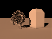
We then moved onto look at another task that we had been given, which was a box, where we would be able to change the lighting of to get a better lightning angle, so that the detail in the design would stand out and be easily seen by the target audience that we were aiming at, the light settings that we had to look at were the fill light, the key light and the back light, these lightning settings were used to create a drop shadow on the box that we were experimenting with. Another task that we looked at was the lightning in the scene where there was box and a tree, which allowed me to look at the design in more detail.


The next part that we did in this process and production lesson was to look at the render settings that we usually use to render the frames, we firstly looked at render to a picture viewer, which allowed me to render my design, which I could then be able to save as a picture. We also looked at edit render settings, which allowed me to look at change the render settings so that the design would be render into a professional and creative design. The last part that we did for this section was to look at the render view, which renders the currently active view. I thought that these render settings would be better than using quicktime for rendering my design.


The final part that we created for this process and production lesson, was a little animation that looked like sheets of paper floating out of the floor, I thought that this task was really cool and fun, however I did find that this task was very difficult and hard. Furthermore, I found that need quite a bit of help on this task because again I found it was difficult and hard to understand the tools that we used to create this design. Overall, I am happy with how this final process and production lesson with Stephen went, I think that using cinema 4D has allowed me to expand on my animation and design skills that I am learning and I have learnt within this lesson.