Monday, 16 November 2015

Influence and Behaviour

Influence and Behaviour.

In this Lecture we learnt about Influence and Behaviour, we did this to have more knowledge on what we influences us when designing and research our own work. We also looked at Behaviour, as we looked how we behaved towards the project that we had been given and how we looked at design work.

What is Influence and Behaviour?

Influence- Is the capacity to have an effect on the character, development, or behaviour of someone                          or something.
Behaviour- The way in which a person behaves in response to a particular situation or stimulus. 

We have many Influences throughout our life such as:
  • Friends and Family
  • Music 
  • Culture
  • Media
  • Political
  • Hobbies
  • Psychological
After this we then looked into the way that propaganda is advertised and why it is so inspirational to us as designers. We looked at Edward Bernays who was a famous Austrian - American pioneer, who is famously known for the term Propaganda. 

Manipulation.

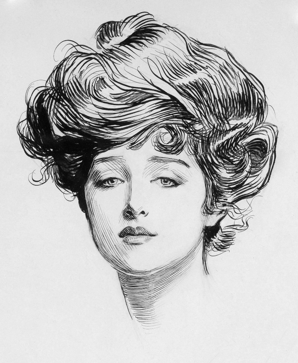
Edward Bernays commercialises Propaganda. He was very interested in looking at how design was shown in World War 1. Edward Bernays trialled a piece of artwork by Charles Dana Gibson in 1907 known as the Gibson Girl. Edward saw inspiration and potential in this piece because it sent a message to the world about War. 


Reference- 


Edward Bernays had also written about book called Propaganda, two famous quotes from his book that he used to say about Propaganda were: 

“The conscious and intelligent manipulation of the organised habits and opinions of the masses is an important element in democratic society. Those who manipulate this unseen mechanism of society constitute an invisible government which is the true ruling power of our country……”

and

“….. We are governed, our minds are moulded, our tastes formed, our ideas suggested, largely by men we have never heard of. This is a logical result of the way in which our democratic society is
organised. Vast numbers of human beings must cooperate in this manner if they are to live together as a smoothly functioning society.” - Edward Bernays

After Edward Bernays had done this he then found that he could use the same methods that he had already discovered in the commercial world, with a company called British American Tobacco.  
Once we had looked at the Edward Bernays we then looked at the topic Torches of Freedom. Whilst looking at the topic of torches of Freedom we decided to focus on the posters that presented message about war that relate to the British American Tobacco company and Bertha Hunt who was associated to womens rights around that time period. 

We then watched a short advert that was based around V Slims, which are blue- E Cigarettes that features an actress, american model called Jenny McCarthy. This video symbolises that she takes back her freedom when using a E-Cigarette rather than normal ones. 

After this we then changed the topic to find your greatness, where we looked at the designer called Wolff Olins who designed the London 2012 Olympic Games logo, however I found out that people didn't understand what the logo was about. I found out the logo was made up of the from numbers, for example 2012, I thought that this was a really good idea because it was related to the year of the London Olympics. 


Reference-

After the logo was created the designer knew that the design could be flexible, as it could be manipulated for the future games. The designer Wolff Olins found that the past olympic games logos were very simple and plain. He designed this logo because he didn't want a logo design that would feature a hurdler jumping over the houses of parliament. 

Once we had looked at the London Olympics logo we then looked at two adverts that had been created for the olympic games. The first was an Adidas Advert that was made for the games because Adidas was the main sponsor of the London Olympics. The advert featured the logo of the London Olympics were the designer for the advert had used prescribed anarchy, which was featured as structured chaos. The second advert that we watched was from Wieden + Kennedy, as they had the task of producing an advert without using the logo of the olympics or relating to the olympics. This is when Nike came up with the Find your Greatness campaign. 


The Nike Advert about Find your Greatness was very inspiring to get motivated and take part in sports. Also Greatness can be displayed in many ways whoever you are, wherever you are. Greatness is not in just one special place, Greatness is whoever it is. 

Next we looked at the legacy that would be created after the 2012 Olympic Games in London, the company known as FCB Inferno won the bid to create the legacy of the Olympic games after they had finished. Sport England then produced a campaign known as the this girl can, because they wanted people to get motivated and get involved in different sports after the Olympics had finished. 


Reference- 

We then looked at the topic of Deception, that related to the company and energy drink Red Bull, which was produced in the 1980's by an Austrian. The drink was introduced to improve your performance and has now become a world wide successful product, that is now used for sponsorship. However Red Bull did have a few problems in there time and are now being careful with how they market there drinks, so that it doesn't effect the target audience in a bad way. For part of the project that many people use for there products is us, as they want to use you as an Asset to promote their product that they have created.  

I found that this lecture was very inspirational because I learnt quite a lot about how influence and behaviour effects us as designers. I thought that the part that I like the best about this lecture was the 2012 London Olympics section because it allowed me to look at the olympics from at different point of view, as I am interested in sport and watched the olympics when they were featured on tv. I found that the information that I learnt about the Olympics was very influential, which allowed my knowledge of the games to widen. I learnt a lot in this lecture and that there is lots of points that I need to consider within my design work for example can you promote your product in ways that aren't? Who is your target audience going to be? Who will see it? When will it be seen? Where will it be seen? and finally How do you want your design work to associate with the target audience that you will be aiming towards?

I think that I am going to take a lot of points from this lecture when creating my design work in the future, as this will allow me to produce professional work that will be aimed at the right target audience. It will also allow me to get inspiration from many influences that are featured in my life and how I act about it. 

Monday, 9 November 2015

Convergence

In this Lecture, we learnt about Convergence and what convergence was? and why is it so important to us. Before going to university I hadn't heard of the term 'Convergence', I found that this lecture was very helpful to me because I found that this lecture helped me to understand what is meant by the word convergence.

What is Convergence?

'Multidiscipline 
Interdiscipline
Synergy
Integrated
Hybrid'

After we had looked at what convergence is, we then looked after different people opinions on what convergence is:
"Convergence is an ambiguous term used by various disciplines to describe and analyse processes of change toward uniformity or union. Its application in the communications sector, often referred to as media convergence, also encompasses valuable approaches and insights to describe, characterise and
understand the digital creative economy". - Media Convergence, Michael Latzer.

Convergence is interlinking of computing and IT, communications networks, and social media.
- Flew 2009.

Convergence is a relationship between media forms, not a transition from ‘old media’ to ‘new media’. - Grant, Wilkinson 2011.

I found that the quotes from different people were very helpful, as it allowed me to look at the definition of convergence from different angles. I thought that this would then allow me to look at the convergence in many different ways rather than just how I look at it. In the future, when looking into convergence I will be able to explore the term in many different ways, as I have found out that people look at convergence in many different terms. After we had looked at opinions by different people we looked at many examples of work that were based around the topics of cross-discipline/inter-discipline, integrated, hybrid analogue/digital and hybrid digital. I found that the work we were shown for each topic were very inspirational, as the work was very unusual and different to other pieces of artwork I have seen. However I thought that the styles that had been used for the designs were very creative, as they had used lots of vibrant colours and font styles that were visibly appealing. 

Thursday, 5 November 2015

History of Graphic Designers

In this Theory Lecture, we learnt about the History of Graphic Design and Animation, we did this so that we could explore the different styles that are used throughout the years and how Graphic Design and Animation has changed over the past years and how it effects us as designers. I feel that this Lecture was really useful, as I was able to look at how the movement of art and design has changed, also I was able to look at the different styles that I could look into and use when doing my secondary and primary research for my sketchbook.


The changes that this Lecture has made to me is that I can now look at designs that were created in the past by artists that were very famous for the artwork within a certain period. I found that this will me to understand the different styles of artwork and when they were created and who by. I decided to create a timeline of the graphic designers as this would then help me to understand how the design movement work over the past 100 years. In the future I am going to refer back to this timeline, as it will help me to find graphic designers that I like from the past and the style of artwork that they produced in the years that their art and design movement became popular and attract the target audience that they were aiming towards.

How do we think about Modernism

How do we feel about Modernism?

In this Lecture we looked at how we as an individual thought about Modernism and how it effects us. However, the first part that we had to do was to look at was:

What is modernism? When was Modernism? What are the relations between historical modernity and the set of aesthetic practices known as modernism? Does Modernity and Modernism have a gender?

What is Modernism?

Modernism is a style or a movement through art, that removes lots from classical and traditional forms.

When was Modernism?

Modernism place in the early 20th Century to 1930’s, which was the same era as the art style Art Deco.

I found that this Lecture was good because we got to look at how Modernism was effecting the Artwork that had been produced in the past, I felt that I learn't some good points that will help when design my own artwork for my own project. In the future this lecture will allow me to look at my own artwork and see whether my designs will effect the artwork that was created in the past.

YSP - Yorkshire Sculpture Park

In one of our Studio session, we went on a trip to the Yorkshire Sculpture Park, I have visited the Yorkshire Sculpture Park several times, as I like quite close to the Sculpture Park. I really enjoyed the Sculpture Park, as it has changed quite a lot since I have been to the Park. This is because there are new sculpture around the Park that I haven't seen before like the Poppies. My favourite sculpture in the park was the Poppies because it was amazing to see how they had been fitted together to create this magnificent sculpture. I found that the presentation of the Poppies were very professional and creative, as the design was very well structured. The colour of the Poppies that were red was very bright and vibrant, which is good because it allows the target audience to see the Poppies very easily.


Whilst I was at the Yorkshire Sculpture Park the weekly task was to focus on the categories, Fringes and Edges and Opposition and Convergence, however I also wanted to focus on the other weekly focuses too for my primary research, as I was still struggling with the research. 

GRIDS

The first part that I decided to focus on whilst I was at the Yorkshire Sculpture Park was Grids, as I had already done lots of research for Grids on my secondary research by researching into Josef Müller-Brockmann. So whilst I was at the Sculpture Park, I decided to look out for the Grid Systems that had been used around the park for inspiration when designing my own artwork. 

I thought that this was a perfect example of a Grid System because it has been used for a fence at the side of a walkway. My favourite part about this piece was that you could use the Grid System, as a Frame to take a good quality and professional photograph that would catch the attention of the target audience very well. I think that the Grid System that has been created is very professional. I will take inspiration from this Grid System when designing my own artwork for my final outcomes, when I produce them.

FRAMES

After I had looked into Grids at the Yorkshire Sculpture Park, I then decided to look at Frames, as again I had researched parts of Frames for my secondary research, however as my project was based around the sense of place of New York, I needed to look at framing as the photographs that I had taken didn't have wasn't really framed. I thought that this was very important part for me to look at, whilst I was at the sculpture park. 

The first two photographs that I chose to take was framing. This was because my friend decided to stand in the arch whilst we took a photograph of it framing around her. I thought that this photograph was a good example of framing because it was a natural frame. I thought that if I was to improve this photograph, I would try to change the colour to add more vibrant colour.


I thought that this Photo was a good example of Framing because it shows how I used the sculptures 
to create a new Photo using other objects. I think that this Photo is very creative, however to improve this Photograph I would ask one of my friends to look through the gap in the sculpture to create an effective Photograph of Framing.


MACRO AND MICRO

Another category that I had to focus on, whilst I was at the Yorkshire Sculpture Park was Macro and Micro Photography, I found this category quite hard because I don't have a Macro lens, which allows me to produce perfect and professional quality Photographs that will catch a lot of detail that will allow the target audience that I am aiming for to understand what is being displayed and featured in the Photography that I have taken. I also found that Micro Photography was very difficult because I hadn't really heard about Micro Photography, as I had only heard of Macro Photography. I learnt that Macro Photography was a photo that is taken and shows detail and Micro Photography is a Photograph that features more detail than a Macro Photograph.

These are some Macro and Micro photography, that I have taken whilst I was at the Yorkshire Sculpture Park. My favourite photographs are of the leaves as I think that the photograph on the bottom right is very good quality, as the photograph that I have captured allows me to see the amount of detail that a leaf features. My least favourite photograph is of the stone wall because I feel that this photograph doesn’t capture a lot of detail like the leaves. 

However, I do feel that the colour of the Stones are very bright, vibrant and colourful, which will catch the attention of the target audience very easily. I think the Photographs that I have taken at the sculpture park are good, however I feel that they could have been better, as I could have used a Macro lens to capture the detail of the objects even more, rather than using a normal camera lens. Overall I am quite pleased with how these photographs have turned out.    


PEOPLE

Whilst I was at the Yorkshire Sculpture Park, I decided to look at the subject of People. I found that this subject was quite hard to look at because I wasn't entirely sure what to take photographs of when it came to the subject of people. My favourite Photograph that I have taken is displayed below, it is of my friend Elenor, I know that this photograph is really relevant to the project of a Sense of Place, but I thought that the photograph would fit into my project somewhere, as it is relevant to one of my categories that I had to focus on.

I like this photograph because it show Elenor's personality, as she funny and lovely, she is also showing her interests in the photograph, I know this because she is acting a part of the opening titles in one of our favourite Tv Shows, Pretty Little Liars.  


This below is another photograph that I like, which I have taken. The photograph below, which I have taken captures people that are looking at the Poppies that we went to visit at the Yorkshire Sculpture Park. I think that these photographs that I have taken are good examples of people and places.


I found this category quite hard to focus on because I wasn't quite sure how I was going display People in my photography work. However, overall I was quite please with my photographs because I think that the photograph capture lots of activities of what people are doing, for example the people that are stood between the trees. 

MOVEMENT

The category that I looked at next was Movement, whilst I was at the Yorkshire Sculpture Park I found this category quite hard to look into because I was sure about what I should photograph that would be relevant to the subject of Movement. However I found the Movement quite interesting, to see how I could work with this category throughout my project.


Whilst I was walking around the Yorkshire Sculpture Park, I came across a horse that was on screen that moving using different slides. I liked this piece of artwork because I found that the animation was very creative and different to the other sculptures that I had seen around the Park. I thought that this animation worked well with the category of movement because it shows that the style animation is used to create a movement. The part that I thought they could improve on was the animal, as they could have looked at different animals other than the horse. I found this part quite hard to take photographs because it was moving at a quite fast pace, as I am not used to my camera I was sure how to take photograph after the other, so it took me longer than I thought to try and take presentable photographs. 

NAVIGATION

The next part that I decided to look at was Navigation, I found that this subject was quite easy to focus on because I was able to look at the different signage that was used around the park, I was also able to look at the different pathways and bridges that people took to find different sculpture around the park. 


Whilst I was at the Yorkshire Sculpture Park, I decided to look at the different signs that were placed around the Park to help navigate people to the different areas and the sculptures that they wanted to go and look at. My favourite sign that I found was the Poppy sign because this sign was very different to the other signs that I had looked at, it was also a specific sign for one of the main sculptures at the Park. I thought that this was a good idea and would take inspiration from this sign when I design my own outcomes.

The sign, which I also like is the sign that is very informative because the sign features a lot of text although this is used to help navigate people around the Park. I think that I will take inspiration from this sign because the text that has been used is very bold and stands out, which helps the target audience to read and understand the sign. I also think that I will take into consideration the colours that I use for my design because the colours that have been used on this sign above are very complimentary, which work very well together.

MATERIAL

I thought that Material was a good category that I could look at whilst I was at the Yorkshire Sculpture Park because it was easy to look at the different sculpture and focus on what they were made from, I then could look at taking inspiration from the materials that are used to create my own design work for the project Sense of Place. 


The first photograph that I have shown below has been created using different coloured stones that have pieced together to create something new, for example like a convergence piece of artwork. The Material that has been used for the design was very rough, however I thought this material work really well for the design because the coloured stones that have been used in this design are very bright and vibrant, which would catch the attention of the target audience very easily. I think that I am going to take inspiration from the material that has been used in this design.


FORM
It was quite hard to look at this subject because again I wasn't sure how I could feature this through my photograph that I had taken whilst at the Yorkshire Sculpture Park, however I was able to find something that is quite relevant to this topic. 

The photograph below shows the Poppies that were created to remember the soldiers who died and were in injured in the first world war. I found that layout of the Poppies were professional because the form that had been used to create this spectacular design worked really well to create a magnificent piece of artwork that would catch the attention of the target audience very easily. 


SOUND

I wasn't quite sure, how I could look at sound, whilst I was at the Yorkshire Sculpture Park because I found that this was probably one of the most hardest categories that I had to look at overall. However I was able to find something that did relate to sound. 

The first photograph, shows the leaves that had fallen from the trees as it was Autumn. I found that whilst walking around the park the leaves that we walked on were crumpling beneath my feet. I like the sound of the leaves being crumpled because it is very crisp as the sound very delicate.


Another photograph that could relate to sound is the lake, as the atmosphere around the lake was very peaceful, as the sound of the water flowing was very calming and soothing. This made the place a somewhere nice to go and spend your time at. 


FRINGES AND EDGES / OPPOSITION AND CONVERGENCE 

Whilst I was at the Yorkshire Sculpture Park, I looked at the artist called Rob Ryan. Whilst I was looking at his work I decided to look at the category Fringes and Edges, I chose this category because the edges of the artwork that he has created by cutting out is very creative. I think that the work he produces overall is very creative, as he uses different fringes and edges for different pieces of work that he has created.


My favourite part about these two designs that were created by Rob Ryan are very creative, as I have never seen a designers work that is so professional and displays lots of detail with their work that can catch the attention of the target audience very quickly. I think that the about of detail that Rob Ryan has put into his work is very inspiring, as I feel that I am going to take inspiration from this work for my own design work. 


I think that the subject convergence is shown int this artwork above because the designer Rob Ryan, has used different elements that have been placed into this design are very good because the design has been made up of different elements to create something new. I like this because it allows the target audience to look at the design in different ways. I think that this design is very inspirational and I am going to take inspiration from this for my own artwork. 


Tuesday, 3 November 2015

How do we think about Postmodernism

In this Lecture we looked at how we as an individual thought about PostModernism and how it effects us. We learnt about what PostModernism is? When PostModernism took place? and does it effect us as individuals in our everyday life today?

What is PostModernism?

PostModernism is a mixture of characteristic, which use early styles of artwork by mixing the artists styles and medias together.

When did PostModernism take place?

PostModernism took place is the late 20th century, where the movement of art, architecture was departure of the movement known as Modernism.

Does it effect us?

I think that PostModernism, effects us a little bit as designers because it has got me thinking about how the mixture of artists styles have influenced me as a graphic designer to create new designs using several different art styles to create something new.

I found that this seminar was really helpful, as it helped me to understand what PostModernism was and how it is used to influence me within my work and how PostModernism will help me with my projects in the future.