The first thing that we were shown was the structure of the lecture.
Prelude
The first part we did was to discuss what Sara was doing within her PHD, where she created films and series. The film that she is creating is called Recipe for Baking Bread. We were then shown a composer that Sara is using within the work, that was a Russian composer in the 19th Century. The next part that we listened to was the song called Brothers in Arms, which I found was very surreal and written in G#, when the words are spoken the music becomes softer. We then listened to the song called Pokerface by the artist Lady Gaga, this is another piece of pop music that is rare to be created in the note G#, I found that this song very upbeat.
Part 1
The first clip we looked at was called J.S. Bach who is an american designer. The piece that we looked at was Strings. It was used using a Cello, I thought that the motion graphics within this piece works very brilliantly and simple, but very creative. The next piece of work was by collective tomato known as Underworld - Alphabet. Within this piece of film footage is used to make this film is very surreal and creative, however I think that this film was very slow.
We then watched another animation by Max Hattler called AANAATT. The film is created using stop motion, I found that this film very fascinating as it fits to the timing of the music. I thought this video was very different to the other designs that I had seen in the lecture. We then looked at a video called UFO. I thought that this was very creative and good because the style was very Illustrative, the colours that were used within the film were bright and vibrant.
Another clip we watched was a music video by Danger Beach. It was well put together, as it showed us the collaboration between designer and musicians in the music video, as this doesn't really happen within the modern day music video as there mainly using video and people. The next music video we watched was Radio Head by No Surprises. I felt that the video could have been better because I thought that the lyrics of the music could have been bolder, as I found it hard to read what was being displayed on the music video.
Part 2
We then moved onto look at where Sara used to work, which was within BBC Sport. When watching a clip we notice that there is always one piece of graphics in the centre of the screen. A software used was like when it was used for a football match that was back and forth. We then watched a clip that was created using vector Illustration about a man hunting a wolf that was hunting sheep. Another clip that we watched was a commercial clip for Radio Head called Kid A Blips. We then watched The Accident that was created for Channel 4. Created by Sara, she said the first and favourite part was her music that was used for the film. For this clip we watched the musical version that didn't have people speaking about the story of the animation.
We then looked at Lewis Hyde that was known for the The Gift, which is about creativity and what happens within the creative process. We were told 'The Gift must stay in Motion'. The final clip we looked at within this lecture was called Understanding Music. I found this lecture good and very interesting.
Monday, 25 January 2016
The problem of representation in Art and Design - Part 2
The first part that we did in this lecture lecture was to recap on what we learnt last week. In today's session we will be looking at Immanuel Kant and his life in more depth and his core ideas.
Immanuel Kant
Immanuel Kant
- Critique of Judgement (1790)
- Critique of Pure Reason (1781)
- Noumenal + Phenomenal
- The Critic (1963)
Noumenal is suppose to be more chaotic, noisy kind of world. We then wondered why don't we perceive that chaotic world, as we linked this to the book called the Critique of Pure Reason written by Immanuel Kant, I think that this was a very good point that was made because we should always look at the world in a perfect and we should be aware about what is happening in the world and around us now and everyday.
We then looked at piece of artwork from the book The critique of Judgement, we found that the structure of the lens and it displays the structure of the world, which means inspire and space.
Kant says that everyone has the same structuring of the world, so we experience everything in the same way. Kant reasoned his way to think like that because he never really his house. He was the first core theist of representation, he was interested in overwhelmed experience and uncomfortable experience. Kant has two ideas which were the sublime and the beauty.
Sublime
Dynamic Sublime - Is experiencing the force of nature.
Mathematical Sublime - Is the thinking of infinity.
Beauty
Is the bounded object, free play of faculties, we can learn something about preferences of our representational system (modernist aesthetics).
Postmodern design will challenge most types of modern design.
We then looked at several videos the first being Powers of ten (1977), we had to bare in mind how hard it is to hold certain categories and why is it hard? I found that this video was very factual, the video displayed what it looks like form the earth surface to millions and millions of miles away. The video then focus on the same point but it looked at the skin of a human. The final tips that we were told to do in this lecture was to have a look at data visualisation:
- Anti sublimity
- Sublimity
- Hybrid Forms
I found that this lecture was very helpful and allowed to me to gain knowledge of points that I haven't heard about before, which will help me in the future.
Wednesday, 20 January 2016
Wednesday Seminar
Within this seminar we watched a clip that feature james using a software on the xbox kinect that allowed him to create shapes when clapping, when the circle was created a sound played. One screen had as silhouette of James, the other had a black screen. We looked at the theory behind the Xbox Kinect and an example of with Marilyn Monroe.
Monday, 18 January 2016
Seminar - Essay
Within this seminar, we were told about what we should bring to Friday's studio session, which was to bring your idea about what you could create for eight of the tracks on unilearn. We were told to make a plan and include what techniques you want to use. We were also told that next Wednesday session would be about how to write an essay. For the next lecture we had to look at all three text by next Monday's seminar, which were Culture/Subculture, Branding and Anti-branding and Prequel/Sequel. For this task we had to deconstruct them all by printing them off and making notes about each of the articles. We were also told that for our essay, we would have to look at our own references by either reading an article or watching a documentary or more. The first part that I need to do for this essay was to choose a question that I want to work with. We were also told that we should use on the one hand and on the other hand, we should look at names of people that you haven't heard of. Another important point that we need to look at for this essay is the structure and the layout.
I think that this seminar has been very useful, as it is very helpful on what I should do when writing my essay.
I think that this seminar has been very useful, as it is very helpful on what I should do when writing my essay.
The Visualisation of Sound
In this lecture, we were given a new brief, which we found out was 5 weeks long, we were also told that our next brief was going to be based around the visualisation of sound. Out of the 10 tracks that had been placed on to unilearn, we had to pick 8 and create a respond to a 20 to 30 second piece from the sound track that we wanted to take. We were then told that we had to come up with 2 experimental responses each week, that would be short and sharp, but still developed. Once we had completed the 8 responses, we had to choose, which of the responses we wanted to take further, however we could only choose one. Within this brief we could use photography, Illustration, Video, Physical 3D or 2.5D.
We were then shown that there was three possible outputs, which were:
We were then shown that there was three possible outputs, which were:
Notation
Interpretation
Experimentation
The first topic that we looked at was Graphic Notation, where we could expand the principles of music. The first part we were shown in the lecture was a photograph of a cuneiform, which displayed to were symbols, I thought that this could represent there own language, which I thought about very hardly, as I could create my own language that could represent the piece of music that I am looking at and exploring. We were then shown a piece of artwork by Schweizer. W. that was created in 2011, I found that this piece of artwork was very creative and colourful, as it showed me as a designer, W. Schweizer's response to the sound track Hurrian Hymn No.6. The next part that we looked at was Notation 21, where we looked at piece of artwork by H. Colding-Jorgensen (1982) that created a response to John Cages music called Chaos.
The next topic we looked at was Graphic Interpretation, where we firstly watched a short clip of the film An Optical Poem, that was created in 1938 by a company called Fischinger. I found that this clip was very basic but very simple and very eye catching, as the graphics caught my attention every time the notes changed throughout the song, which I thought was very important. We were then shown an album over that was created by Roger Dean in 2004 for the band called Yes. I found that this album cover was very interesting and very detailed but simple, as it caught my attention very easily. We then talked about the possibility of album covers that we could create for our Visualisation of Sound project. Another CD cover we looked at was Tina Brooks (1960) called True Blue, I found that this CD cover design was very simple, but I found that the design was very creative and different the design that I had been shown before by Roger Dean.
After this, we then stayed on topic of CD covers, but looked at the designer called Jonathan Barnbrook, who has created several designs for the late David Bowie's Albums. We were firstly shown a image of the Next Day, which featured a white square placed in the centre, but over David Bowie's head that displayed the words 'The Next Day' in bold, black font style that would stand out. We were then shown The Vinyl cover for David Bowie's latest album called Blackstar, I found that this design was very creative as the shapes displayed towards the bottom of the cover were displayed to how the name Bowie's, which I saw very easily once it had been pointed out on the vinyl cover. Another possibility that we could do for our visualisation of sound project is that I could develop a font that could be used to respond to the music.
Once we had done this we were then shown a clip called Interplay by Jonathan Barnbrook in 2009, we were firstly shown the digital version of the clip that was for the band John Foxx and the Maths. I found that this design was very interesting however I did feel that the design could be improved very easily. We then watched the final version of the clip called Interplay that was improved with an analogue video mix, I found that this was a lot better than the first clip that we saw because it more creative and effective towards the target audience, as I felt that this clip would catch the attention of the target audience a lot more. We were then told that when creating our outcomes, we should always think about the way the music has been produced, either by it being Electronic or Acoustic or Recorded. Also how the music was put together.
The final topic that we moved onto in this lecture was Graphic Experimentation. Within this topic the first part that we looked at was an interactive visualisation of sound that was made for real estate by company called Hakuhodo (2013), I found that this piece of experimentation was very interesting and creative. Another possibility that we could use within our design work would be to just use elements of the song. After this we were told about Lyric Videos that could create a experiment for our project, we were shown an clip of the Lyric video from the song called Home. Dir. Sophia. Rey by Leah ft Will. I. am (2015), I found that this design was very creative, as the style of the video was very detailed, but simple as the style that was used for the design was Illustration. A pointer that we were told was that the outcomes needs to be quick to produce.
We were shown a clip that was created by Good Books called Metamorphosis, which was the Antfood, Buck and String theory (2012). We found that the clip had commissioning sound and featured the author called Hunter S Thomson, I found that this clip was very interesting but scaring as the illustration that had been created for the design were very strange. However another point that could take from this was to consider using this method by creating my own music and producing my own graphics to the sound, to create visualisation of sound experimental piece.
The final part that we looked at within this lecture was a clip by V. Lodigiani (2014) called A few moments of Mess, I found that this design wad very inspirational, as it included a lot of detail and different elements that created one piece of artwork to respond to the music that was playing.
Tips that we were given in this lecture were:
- Focus on developing/enhancing your technical skills for each different piece of music.
- Utilise simple assets, but give them character.
- Use royalty free music if you intend to publish publicly on the web.
I found that overall I enjoyed this lecture, as we get to work on a new brief that can improve my existing skills and learn new skills that will help me to produce 8 experimental outcomes for the brief that I am going to working on.
Introduction and the problem of representation in Art and Design.
In this lecture, we were firstly introduced and shown the topics that we were going to be covering over the course of this term. To make sure I had an idea of what topic we would be covering each week, I decided to create a plan by writing down each topic and the week that we will be focusing on this.
1. Week No. 21 - 18th January 2016
- Introduction and the problem of representation in Art and Design, Part 1.
2. Week No. 22 - 25th January 2016
- The problem of representation in Art and Design, Part 2.
3. Week No. 23 - 1st February 2016
- Modernism (s) and Postmodernism (s), Part 1.
4. Week No. 24 - 8th February 2016
- Modernism (s) and Postmodernism (s), Part 2.
5. Week No. 25 - 15th February 2016
- Images as arguments
6. Week No. 26 - 22nd February 2016
- A process-relational approach to practice-based research
7. Week No. 27 - 29th February 2016
- Workshop Week 2 (No Lecture)
8. Week No. 28 - 8th March 2016
- Varieties of Semiotics, Part 1
9. Week No. 29 -15th March 2016
- Varieties of Semiotics, Part 2
10. Week No. 30 - 22nd March 2016
- The production of the New, Part 1
Easter Vacation
11. Week No. 31 - 19th April 2016
- The production of the New, Part 2
12. Week No. 32 - 26th April 2016
- Recap, Summary consolidation.
In this lecture we firstly were told about Modernism and Postmodernism and what they mean, I found that this really helped, as I was able to recap on what I had learnt last year about these two topics. I found that Modernism is a type of movement of art that removes classical and traditional forms, we also found that Postmodernism was a mixture of characteristics, that uses early styles of artwork by using different artists and styles. We were then told about Liquid Modernity, which is a characterisation of highly developed societies that are global.
Once we had looked at these points we then talked about images and encountering an image can do something to you and next to accademia is horror. This is because it tries to position a text and look at a piece known theist, process-relational approach. We found that when writing a piece of text, we keep writing, rewriting and referencing other peoples work. Everything we create is a process (creative ways), creating something new. This tells us how we think about everything as an argument.
We then talked about Semiotics, we were told that the we will be looking into three versions of semiotics. Semiotics is the production of signs and conservative semiotics is the version that the designers are most interested in. The final part that we talked about in this lecture was about a German Philosopher called Immanuel Kant, who was born in 1724 on the 22nd April and died on the 12th February 1804 in Konigsburg, Germany. We were told that he argued that the fundamental concepts of the human mind structure human experience, we found that his reason for this was Molarity.
I found that this lecture was good, as we were able to recap a little on what we learnt last term and we were able to understand what topics we will will be covering in this term.
Sunday, 17 January 2016
Unlocking Innovation
When we think about reframing, we think about how we can reframe a problem that can help unlock creativity and innovation. In this seminar we learnt that taking something in a different perspective can lead to lots of amazing breakthroughs. An example that we looked at was:

'What is the sum of 5 plus 5'
and
'what two numbers add up to 10'
The first question we shown only had one answer to it, however the second question had multiple, as it had several solutions. We found out that these two problems will differ only in the way that they've been framed. Another point, is that if you change the frame, it will change the range of the possible solutions.
We were then told that if we create frames for what we experience and they both inform and limit they was that we think. I think that this point is very important and we should break it down and look it very differently.
We were then shown a photograph, where we looked at different methods of how we could get across a river. This was instead of using a normal bridge, we looked at a photograph that showed a bridge being held up by three ballons. I thought that this was a good idea and really clever, it was created a by an architect called Michael Barry. When looking at the Composer called John Cage, who made you think about sound tracks within films and whether one had been used for the film or it was just sound effects.
We also looked at a man called Scott Summit, who was is the founder of a company called Bespoke, that worked with prosthetics for people that had lost a limb. We found that he wanted to create fashionable items, as he wanted to make them realistic as possible.
Our task for today's seminar was to create a piece of artwork that would create a transformation from one word to the other in 9 stages, using either pattern, colour, type or imagery. This is to merge the stages into a narrative visual, which means we had to reframe our approach and reveal a meaning of our choice.

The words that I chose to us for my design were Upside and Down. I wanted to show the process that my word went from one to the other. I started by keeping my words upwards, so that it was easy to read. Within each process I changed letters from upwards to upside down, I found this very interesting and clever. I also found this task very hard, but an enjoyable task, I think that I could improve this design even further if I had more time. Although overall, I found this seminar was a good idea, as it was very creative.
Wednesday, 13 January 2016
Problem Solving Design and Communication
I found this seminar very interesting because we were able to look at inspirational Infographic Design because I think that the designs are very professional and graphic. Within this seminar, I was able to explore into ways to interpret facts and observations through information graphics.
We firstly looked into the designer called Harry Beck, who is famously known for the London Underground Map, we found that there is lots of versions of the Map and it can be used for many different uses. I think that the colour of the design is very bold and bright and allows the target audience to understand the different routes on the Map. I think that this makes the design very important, the font style that has been used for the design is also very bold and easy to read, which is another important part to the design.

We firstly looked into the designer called Harry Beck, who is famously known for the London Underground Map, we found that there is lots of versions of the Map and it can be used for many different uses. I think that the colour of the design is very bold and bright and allows the target audience to understand the different routes on the Map. I think that this makes the design very important, the font style that has been used for the design is also very bold and easy to read, which is another important part to the design.

After this we then looked at the Glasgow School of Art, where we looked at different pieces of work that is shown quite graphically. The final piece of Infographic Design that we looked at was created by a girl who created an Infographic based between generations from her - mum - grandma. I think that this design is very creative and the colour of the design is very bright, vibrant and attractive, as it would catch the attention of the target audience that would be interesting in looking the design.
The task that we were given was to create Curriculum Vitae or a Graphic CV . I found both choices were very creative, however I decided to create a Graphic CV because I found that this design looked very interesting and quite fun.

I am happy with how my design turned out in the end because I found that the layout of the design was very professional and I had presented my information in a presentable and understandable way that the target audience would be able to see and read easily. The colour scheme that I chose for this design was very simple and basic, as the colours of the design that I have used are Black and White. I wanted my colours of the design to be very simple and not overpowering, however I still wanted them to be bold and attract the target audience that I am showing my CV to. The font style that I have used is Avenir Condensed Hand Ultra Light and Regular. I chose to use these font styles because it was bold, simple and easy to read, which I think is very important because you need to make sure that the target audience can read it easily. The Illustrations that I created for the CV, are very detailed and can be easily understood what is being displayed. I used the programme Adobe illustrator to create these Illustrations, where I used the Pen and Pencil tool to create and add detail to my design.

I am happy with how my design turned out in the end because I found that the layout of the design was very professional and I had presented my information in a presentable and understandable way that the target audience would be able to see and read easily. The colour scheme that I chose for this design was very simple and basic, as the colours of the design that I have used are Black and White. I wanted my colours of the design to be very simple and not overpowering, however I still wanted them to be bold and attract the target audience that I am showing my CV to. The font style that I have used is Avenir Condensed Hand Ultra Light and Regular. I chose to use these font styles because it was bold, simple and easy to read, which I think is very important because you need to make sure that the target audience can read it easily. The Illustrations that I created for the CV, are very detailed and can be easily understood what is being displayed. I used the programme Adobe illustrator to create these Illustrations, where I used the Pen and Pencil tool to create and add detail to my design.
Monday, 11 January 2016
Expanded Genealogy
In this seminar, we talked about Expanded Genealogy, which about genealogy but it is more depth, I felt that this would be a good idea to do this because it would allow me to look into the topic even further, which would allow to understand the topic better than before. I thought this would help me a lot more in the future because I think that this will allow to work a lot better, with a better understanding of the topic and why Genealogy, is so important to us as graphic designers. The first part that we learnt about in this seminar is Future Genealogy.
Future Genealogy is known a reversed family tree, that are not conducting. A Genealogical Method that is mostly famous was made by Michel Foucault who was born in 1926-1984, who is a french archaeologist and psychologist.
What is a Method?
It is a way of doing something, it is a path that you can follow.
What is Methodology?
It is the knowledge of the way you are doing the thing. The Knowledge of the method.
After this we then talked about pre-conceived and what was meant by this term we going to be learning about. The genealogist examines the pre-conceived and questions the phenomenon that "we tend to feel this without history" Pre conceived means to examine something which is pre thought. We then thought of many things that might be seen as no history, these include colour, electricity, goodness, badness/evil. Looking into this subject even further we looked at a book written by Friedrich Nietzsche called Beyond Good and Evil, which was produced in 1886. I found that this book was based on two pre-scribed notes. We found that the fabrication of concepts meant there was a positive form of production and creativity, as it is therefore something. I found that this was an interesting point because it shows that if something is produced positively it is known as something, which the target audience will like.
Future Genealogy is known a reversed family tree, that are not conducting. A Genealogical Method that is mostly famous was made by Michel Foucault who was born in 1926-1984, who is a french archaeologist and psychologist.
Genealogical Method?
What is a Method?
It is a way of doing something, it is a path that you can follow.
What is Methodology?
It is the knowledge of the way you are doing the thing. The Knowledge of the method.
After this we then talked about pre-conceived and what was meant by this term we going to be learning about. The genealogist examines the pre-conceived and questions the phenomenon that "we tend to feel this without history" Pre conceived means to examine something which is pre thought. We then thought of many things that might be seen as no history, these include colour, electricity, goodness, badness/evil. Looking into this subject even further we looked at a book written by Friedrich Nietzsche called Beyond Good and Evil, which was produced in 1886. I found that this book was based on two pre-scribed notes. We found that the fabrication of concepts meant there was a positive form of production and creativity, as it is therefore something. I found that this was an interesting point because it shows that if something is produced positively it is known as something, which the target audience will like.
When then talked about whether Genealogies sound like it is Subjective or Objective. We found that Genealogies are subjective, as you are strongly 'present' in the study. I found that this was a good point because it means that the point you make will effect the study that you are in now. However objectivity doesn't allow involvement for the researcher. We then looked at the design called Michel Foucault who asks:
"what right have [historians] to impose their tastes and preferences when they seek to determine what actually occurred in the past."
Once we had looked at this we then talked about Eternal truth, which means it is Pre-conceived and genealogy is a method to conduct an enquiry. It is an event that is different when you are not there and it can be seen from different perspectives. However, Genealogy claims that there is no eternal truth and it is ever expanding. Michel Foucault claims:
"the purpose of history, guided by genealogy, is not to discover the roots of our identity, but to commit itself to its dissipation."
We found that the root means the eternal truth, the dissipation means scattering and disregarding. Finally the identity means that it is Foucault subject. It means its not about making big statements and the philosopher does not have access to the eternal truth.
We then started to look at cartoons and we were told to think about how every cartoon and films begin. From the Simpsons, Futurama, Bob's Burgers and South Park. We looked at the music the characters are doing there own thing at home, which is an establishing shot. Whilst looking at cartoons we looked into the disney theory and how the disney characters are connected through the films, as they are sometimes spotted in a film that they are not the main character in, as they could be seen in the background when you look carefully. We looked at how the Disney characters are connected through easter eggs, as it is form of fabrication.
I found that this seminar was very interesting and learnt lots of points that I hadn't looked and heard about before. I found that this would definitely help me in the future, within my design work.
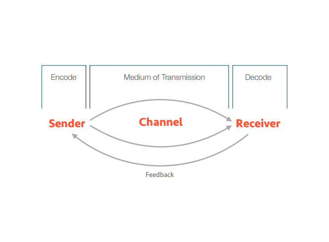
Meaning and Message
Within this Lecture we looked into more depth of what meaning and message actually meant and why it is so important to designers. At first, I found that this lecture was quite hard to understand, however as the lecture went on I understood a lot better and about the topic. The first part that we learnt about in this lecture was the difference between poetry and practical messages, which is that the latter are successful, however only when we correctly infer the intention. This was said by an American Graphic Designer called Michael Rock.
We then looked at both the definitions of Message and Meaning, and the difference between the two. The first term that we decided to look at was Message, this meant:


We then looked at both the definitions of Message and Meaning, and the difference between the two. The first term that we decided to look at was Message, this meant:
"A (Usually) short communication transmitted by words, signals, or other means from one person, station, or group to another."
we then looked at the definition of meaning:
"Meaning is what the source or sender expresses, communicates, or conveys in their message to the observer receiver, and what the receiver infers from current colours."

We then looked at the topic of send (encode), when looking at this we found that send means transmitting a message into symbols of forms, which means translating the message into symbols. A good way for the sender to improve encoding their message, is to mentally visualise the communication from the receiver's point of view. I think that this point is really important because you as the sender should always think about the message before sending the message and how it would effect the receiver. The sender should ask themselves different questions; so that they can select the appropriate channel. These could be:
Is the message urgent?
Is Immediate feedback needed?
Is documentation or a permanent record required?
We then looked further into channel medium, which is important to understand that each channel (medium) has its own strengths dependent on situational effectiveness. After this we then looked at signal, you need your signal to be more understood. Signal means it create a clearer message to the target audience, which allow them to understand a lot more.


Design Authorship
We then looked at design authorship, which is if the designer sets there own agenda.
Once we had looked at Design Authorship, we were then told about the UK designer called Anthony Burrill, he is famous for his work that features block printing, he has also set up the project called Google Beach. Here is a piece of his work that I found very interesting:


Reference-
I think that this project is very interesting and a good way for people to enjoy there day in Cannas, France. I think that the typeface that has been used for the design is very bold and stands out well on the sign that has been displayed, I also think that this allows the typeface to be seen and read easily by the target audience that this sign will be shown to. I think that the colour of the words stand out well on the sign, I think that the colour of the words is very important because it is easy to see by the target audience. We were then shown a quote by Michael Rock, which I found was very interesting this was:
"Authorship may suggest approaches to the issue
of the design process in a profession traditionally
associated more with the communication rather
than the origination of messages."- Michael Rock
I think that this quote allows us to think about how we should send message through are design work as we could display different message through different features or the feature you want to focus on could display different messages. After this we then looked a Richard Linklater who is a Director and Writer, who has directed the film 'Boyhood' I haven't seen this film but I know that it is film that has been film over several years that the follows a boy that growing up. We found that Richard Linklater has always questioned how to send a message to the audience.
“Are we sleep-walking through our waking state or
wake-walking through our dreams?”-Waking Life (2001) I found that this quote from the film was very strange and mysterious. We then watched the trailer of the film Waking Life, I found that this clip was again strange and random. However, I did find that it was nice design style, which was used for the trailer that was Vector Illustration.
Once we had done this we looked at a company called Kurzgesagt, that he has worked with many companies. Whilst looking at this company we were shown a short clip called in a nutshell, which was create in there spare time, when I watched the clip I noticed that the clip was based around science. I found that the clip was very educational, that included lots of facts and figures about the Electromagnetic Spectrum, I thought that the font style was very nice and the colours were very bright. The style that was used for this clip was Vector Illustration, I found that this style was very detailed and creative.
We then moved onto the topic of Receive, which means decode. Where we looked at a man called Marshall Mcluhan who became a key figure in media studies and the effect of the technology to people. He was the writer of the book called 'The medium is the massage', we also found that he became famous for his quotes and sayings, such as:
“Survival is not possible if one approaches his
environment, ‘the social drama’ , with a fixed, unchangeable
point of view — the witless repetitive
response to the unperceived.”
For the final part of the Lecture we watched a documentary shown by the CBC News about Marshall Mcluhan in 1999, the documentary told us about his life.
I found that this lecture was very useful because I learn't about many points that would become useful to me, when I am producing my own design work. I will always think about how I can display the message I want to express through my design work.
Subscribe to:
Comments (Atom)